

The intersection of collaboration & craftsmanship
Southtown is a family owned and operated luxury home builder in the Austin area, creating beautiful homes with incredible collaboration and craftsmanship.
They came to us with our favorite kind of problem, a successful, growing business with a brand that didn’t match their quality and experience. They wanted to “level up” their brand presence to match the quality of the homes, build more trust in potential clients, and create a better customer experience that would wow their new homeowners at every step of the process.


Friendly luxury
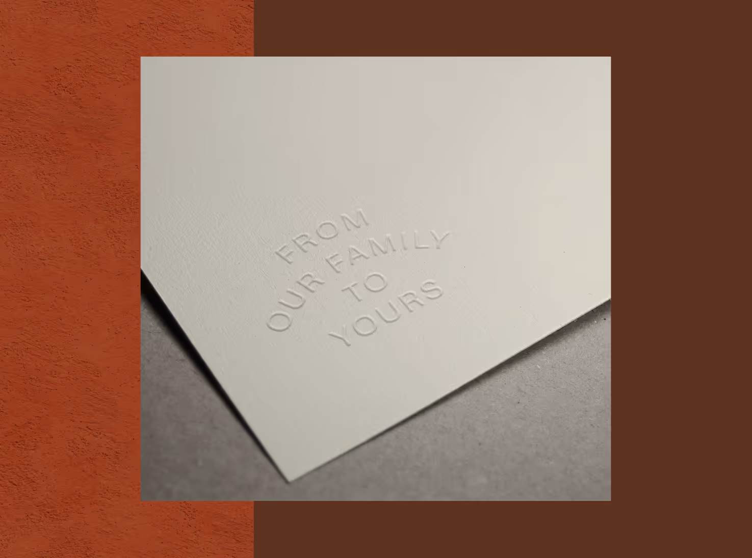
The brand needed to feel elegant and approachable, encompassing the quality of their builds, the boutique experience of their small team, and the innovation and collaboration that they bring to the entire process.
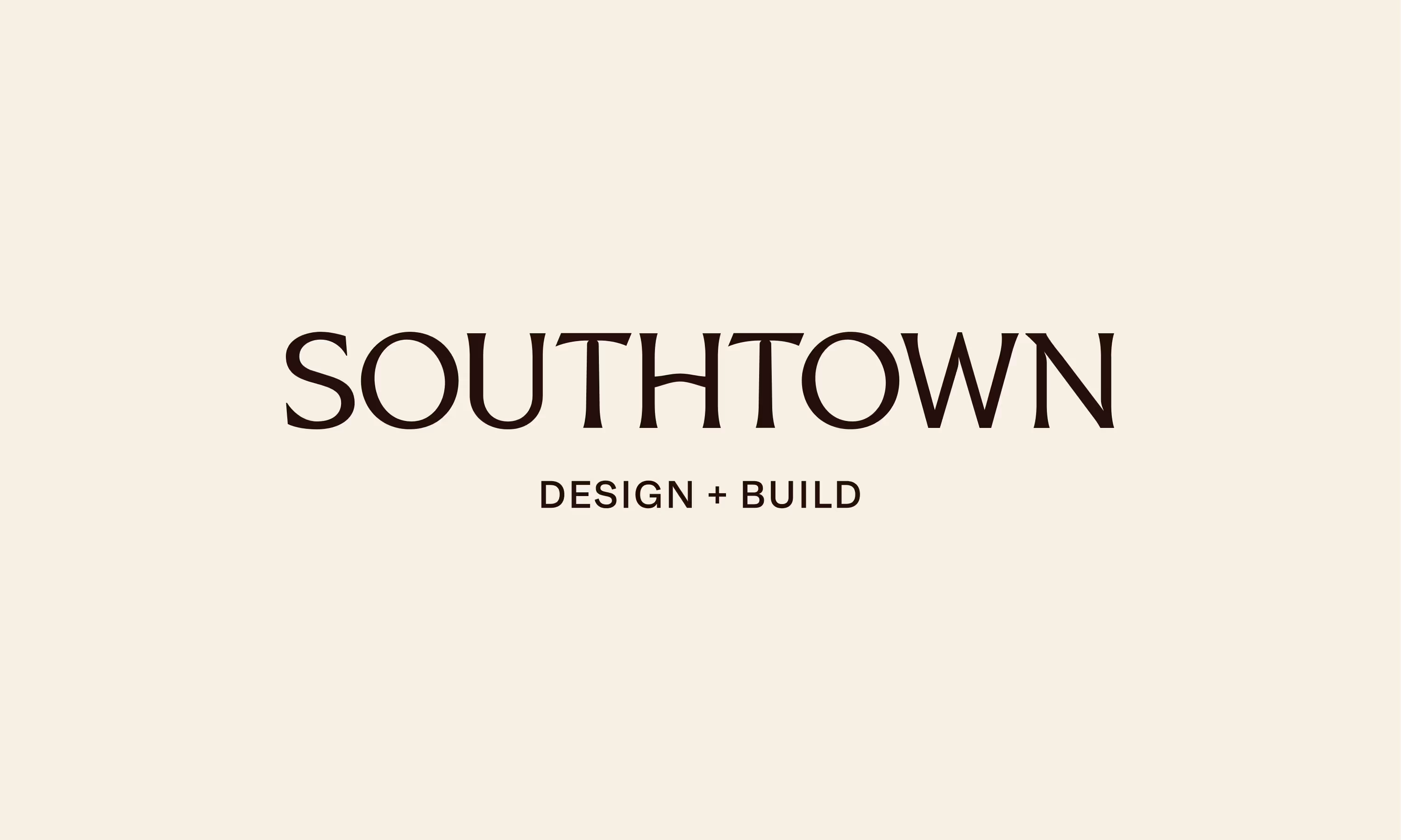
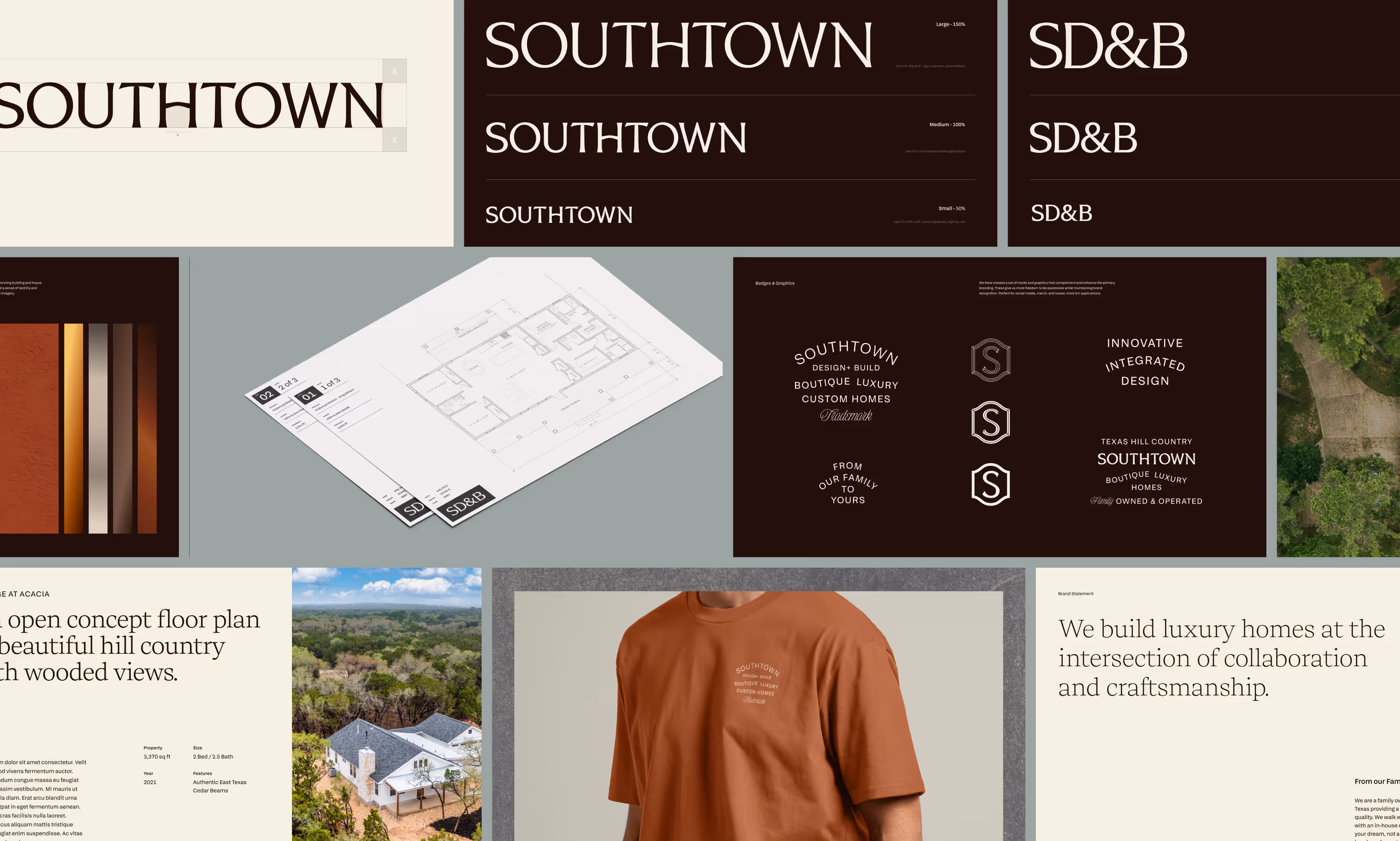
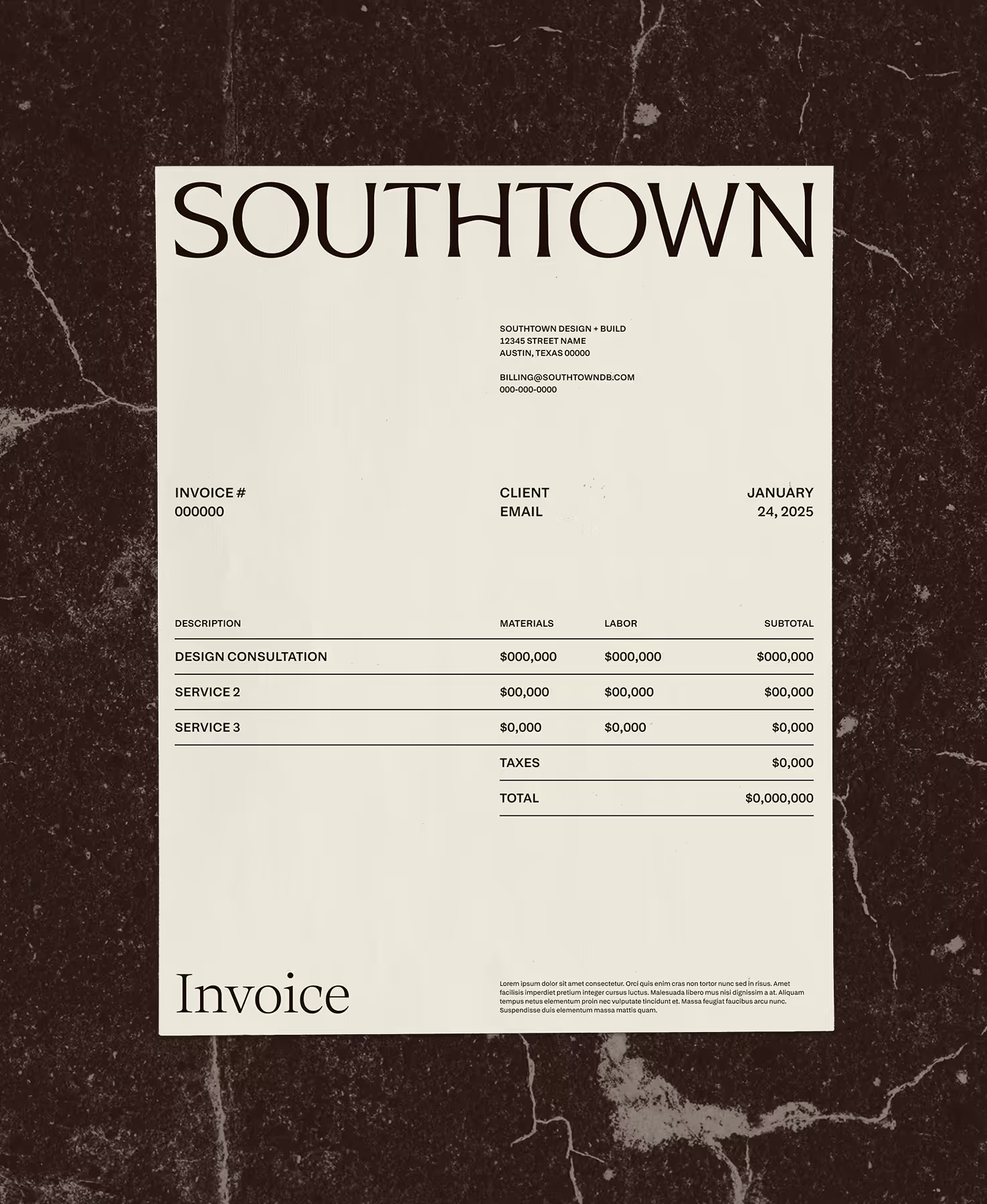
First came the logo. We explored a few icon options, but after we landed on this wordmark, we decided it needed to be the star. “Southtown” is a strong, balanced word, and we executed it in an elegant serif that could stand on its own at any size. Once the logo was settled, we took the S and built an icon for smaller applications. Executed like a fancy doorknob or a nameplate, we like to think it feels gold even when it’s in black.
Friendly luxury
The brand needed to feel elegant and approachable, encompassing the quality of their builds, the boutique experience of their small team, and the innovation and collaboration that they bring to the entire process.
First came the logo. We explored a few icon options, but after we landed on this wordmark, we decided it needed to be the star. “Southtown” is a strong, balanced word, and we executed it in an elegant serif that could stand on its own at any size. Once the logo was settled, we took the S and built an icon for smaller applications. Executed like a fancy doorknob or a nameplate, we like to think it feels gold even when it’s in black.

A plot device
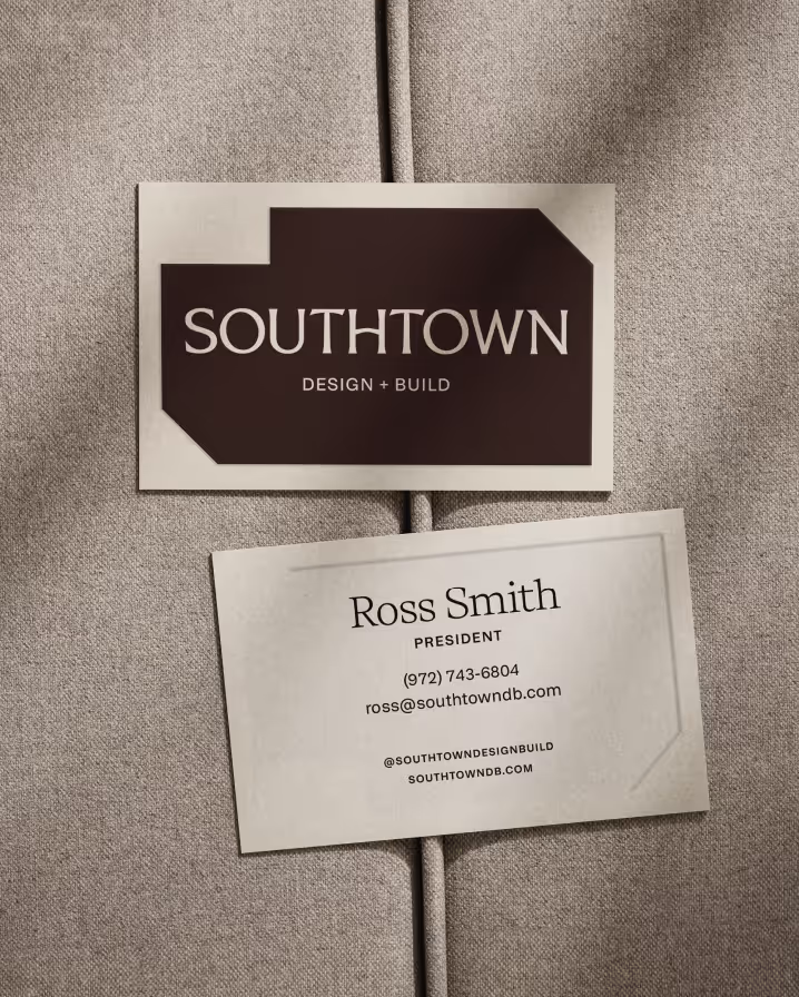
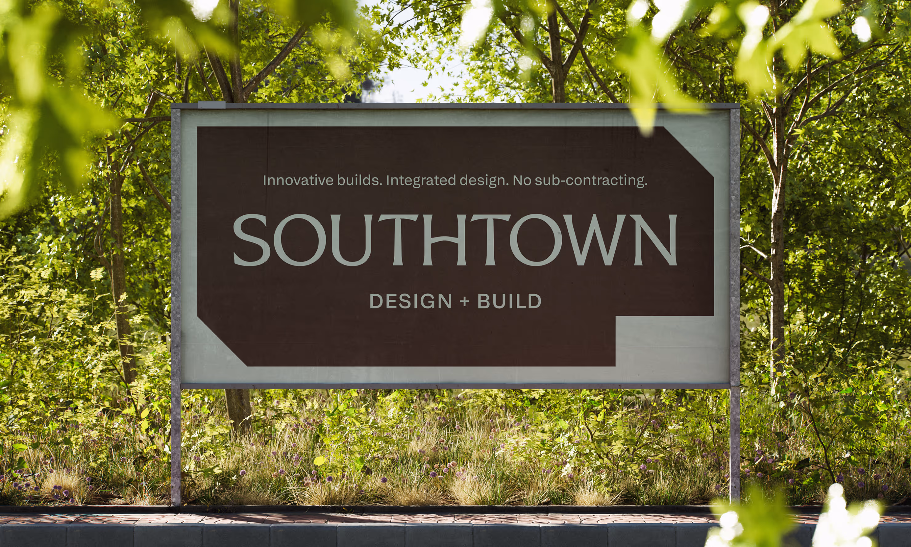
Moving into the rest of the brand, we landed on the concept of “The Plot”, a geometric, abstracted shape that references the floor plans of their homes and the plots of land that they sit on. Representing the beginning of each project, when the possibilities are endless and the home has yet to take shape on top of it, this became a holding shape, frame, and graphic element throughout the rest of the brand.
A plot device
Moving into the rest of the brand, we landed on the concept of “The Plot”, a geometric, abstracted shape that references the floor plans of their homes and the plots of land that they sit on. Representing the beginning of each project, when the possibilities are endless and the home has yet to take shape on top of it, this became a holding shape, frame, and graphic element throughout the rest of the brand.
The Website
The website flowed easily out of the brand, pulling back slightly on the complexity to allow their beautiful photography and messaging to shine. We developed some subtle gradient linework to frame the content, nodding to blueprints, plans, and sketches. We focused on large, elegant text and delicate animation, with a subtle use of cut corners on some of the imagery to mimic the Plot shape.