
We were overjoyed to receive an email from David at Bits&Letters asking us for help visually overhauling the brand of his new company Bits&Letters. David is an industry veteran, he's shaped platforms at Google, Adobe, Stripe, and Webflow, wrote a whole book, and he is an absolute pleasure to work with.
From the Bits&Letters website, because we couldn't say it better ourselves: "The web should make growing your business easier. Instead, most teams are stuck between bad options: drag-and-drop site builders that can't keep up, or enterprise systems that eat your budget alive. That messy middle is where most companies live today. We started Bits&Letters to change that. With 25+ years building for startups and giants alike, we design and implement modern systems that are right-sized for your team and built to grow with you."
From our very first meeting we realized David was directly on our wavelength, ready to dive deep into design concepts and exploration or geek out over our newest design inspirations. In the strategy phase we identified our key design goal, to bring tactility and clear human fingerprints to the purely digital space of web systems.


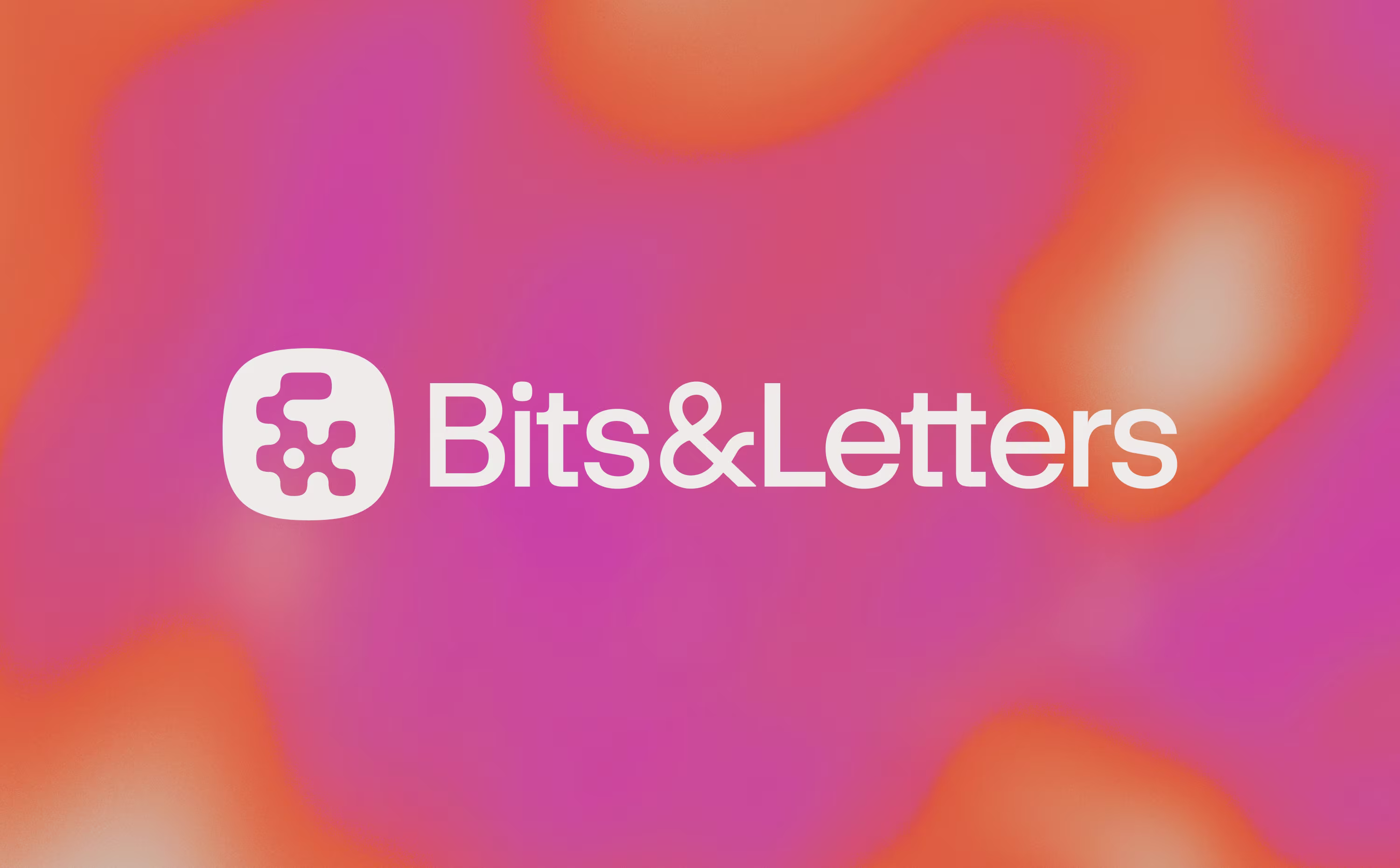
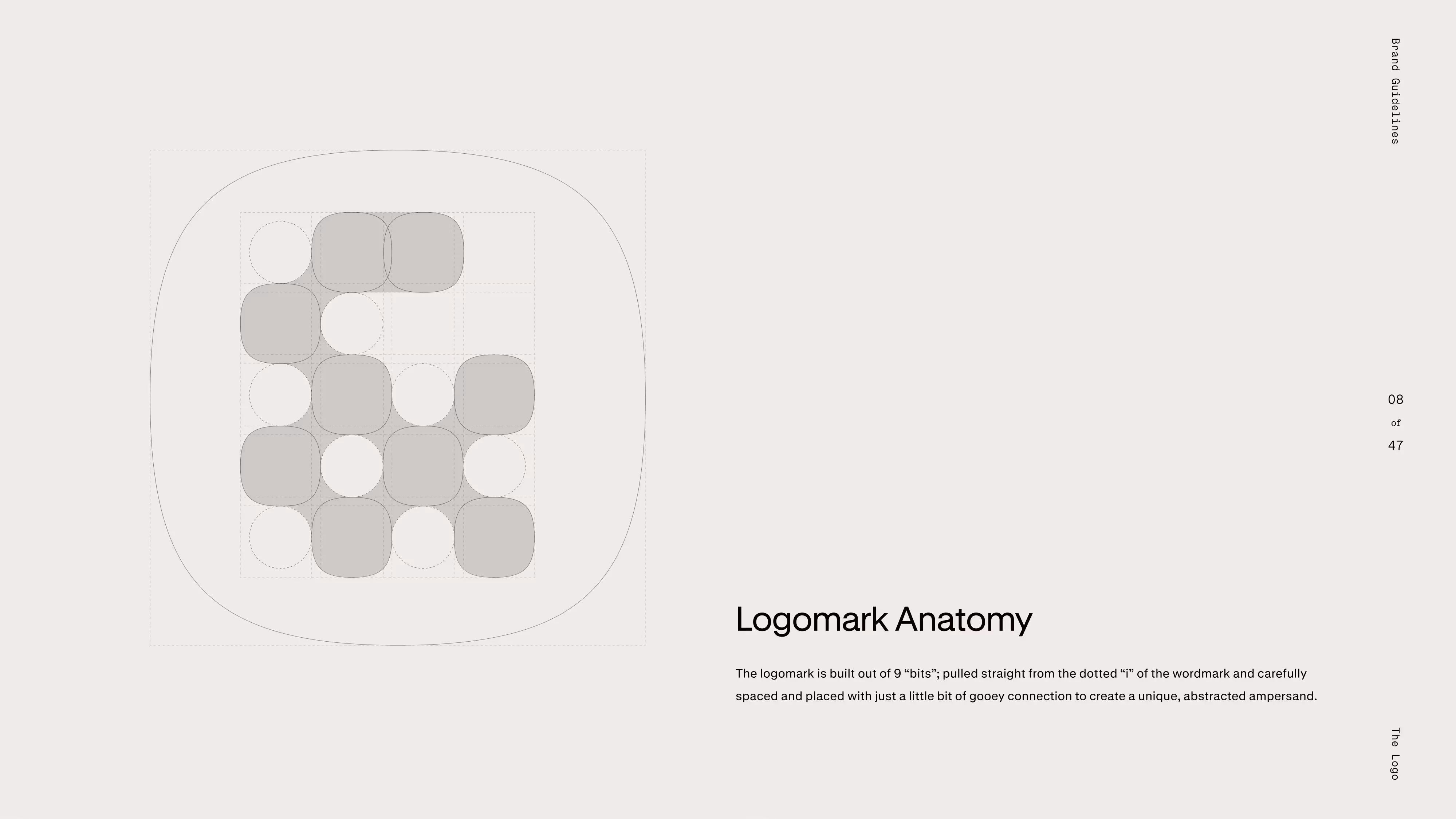
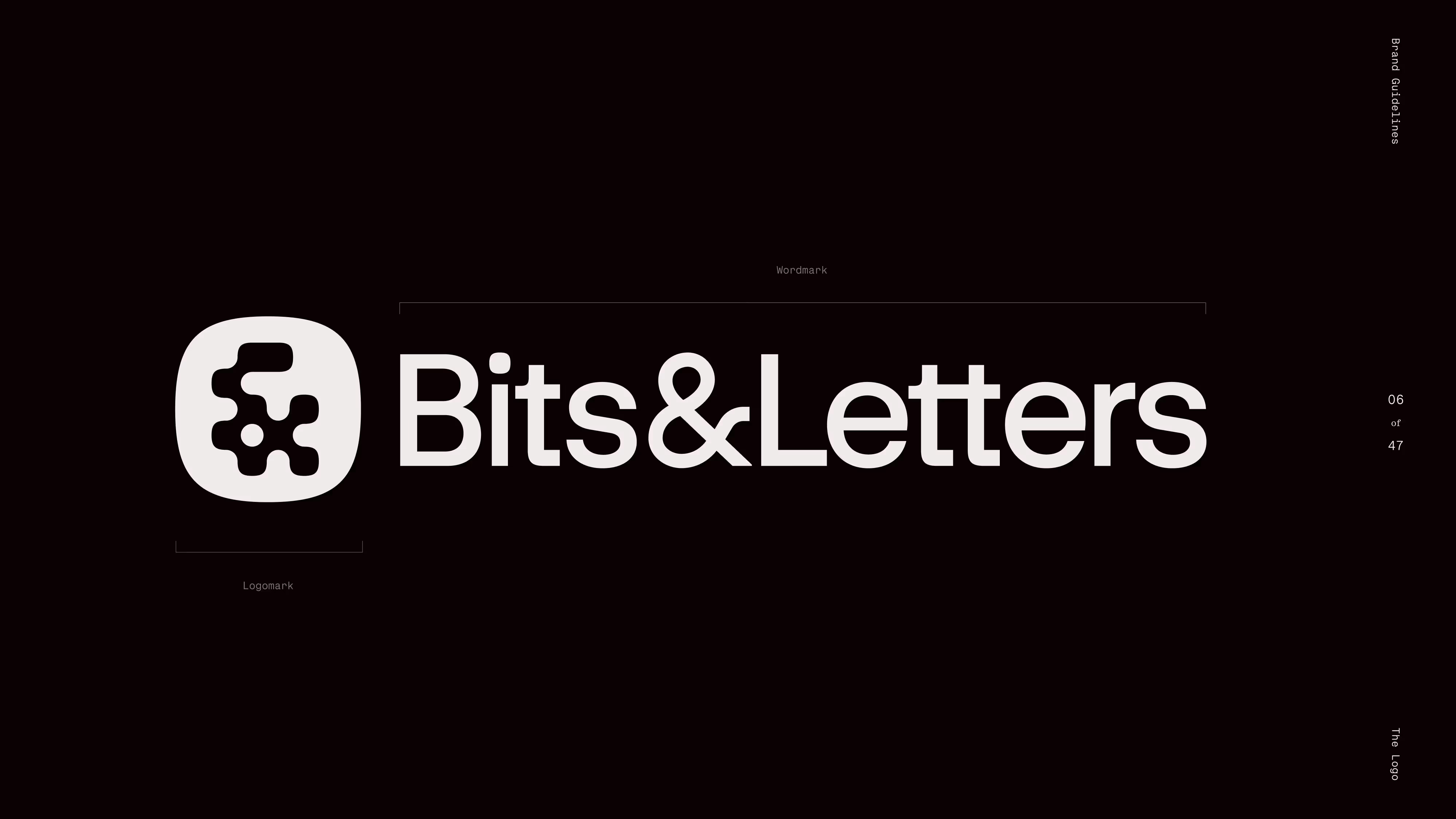
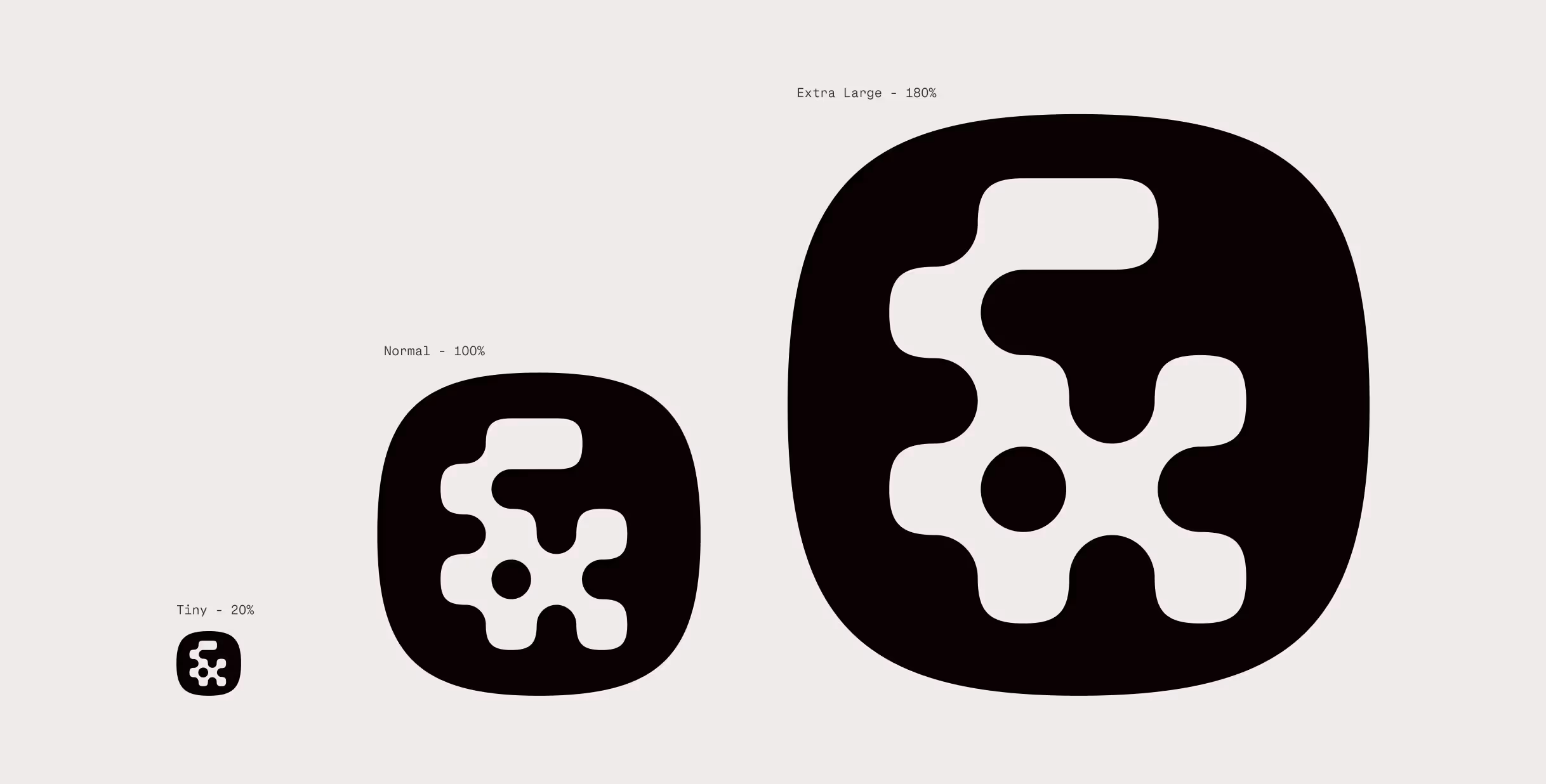
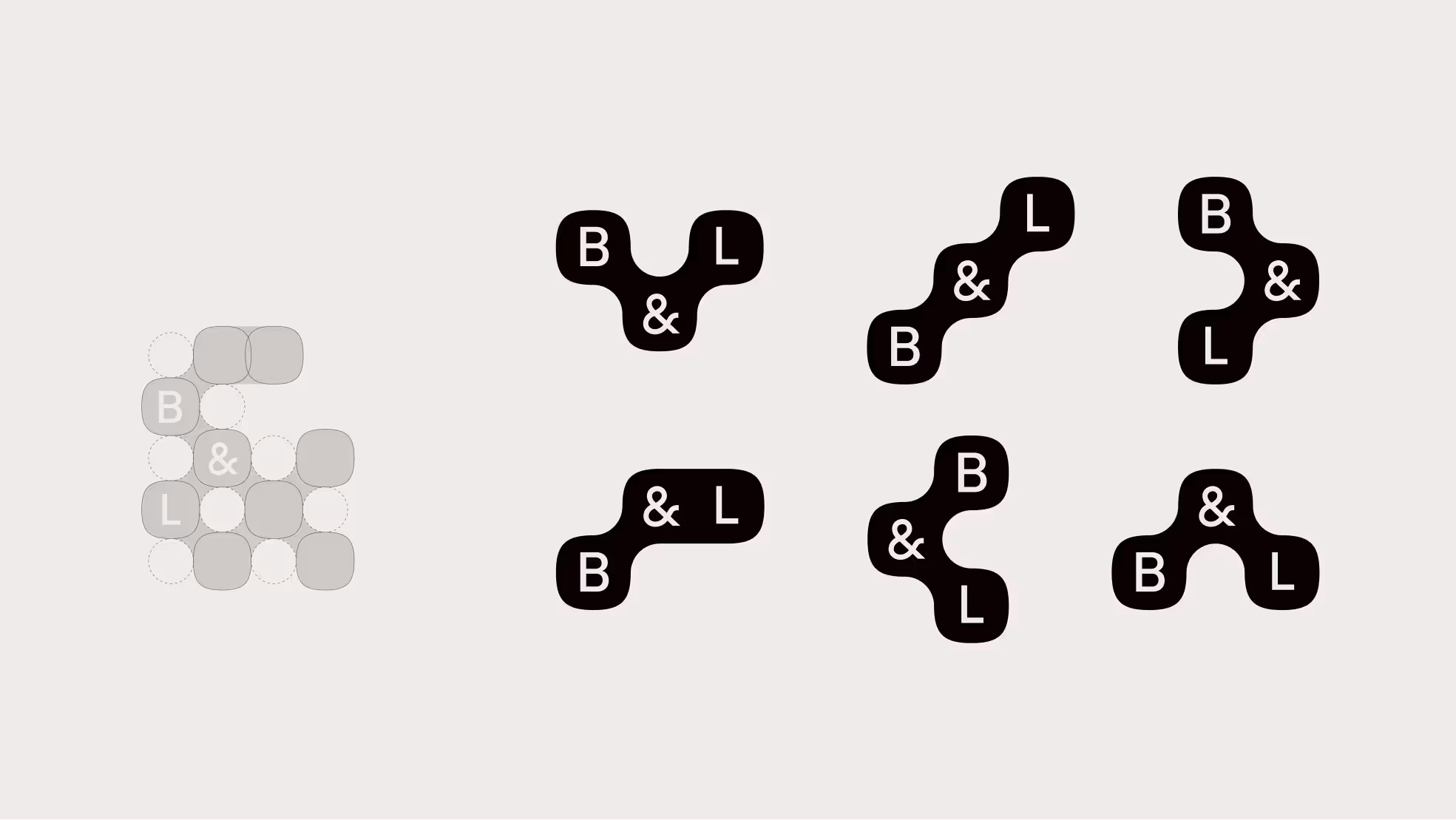
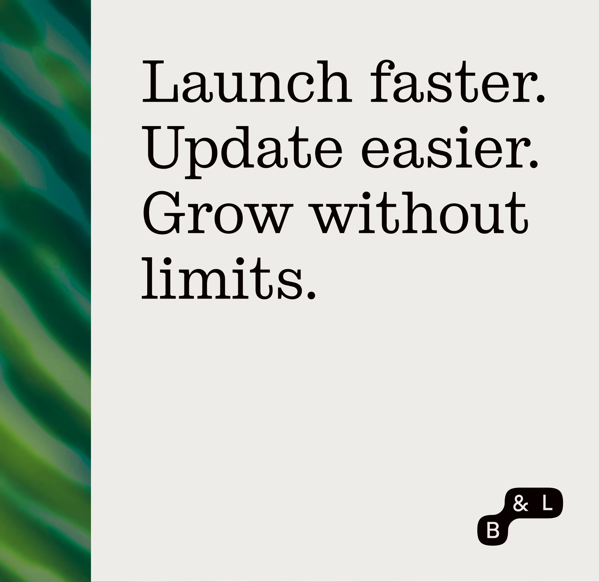
Owning the "&"
David had been using an ampersand as an icon, but wasn't happy with the execution and was worried about it feeling too generic. We spent a while exploring different icon options, but we kept coming back to the ampersand. It's such a great shape to work with and eventually we found a concept that felt specific to B&L, unique, recognizable, and worked great in the context of the larger brand. Built out of 9 "bits", it's an incredibly scalable mark that can stand alone or work with the wordmark in a larger logo. Moving into the rest of the brand we continued to use and play with the "bit" shape, creating a baseline of cohesion that allowed us to really explore texture and color.

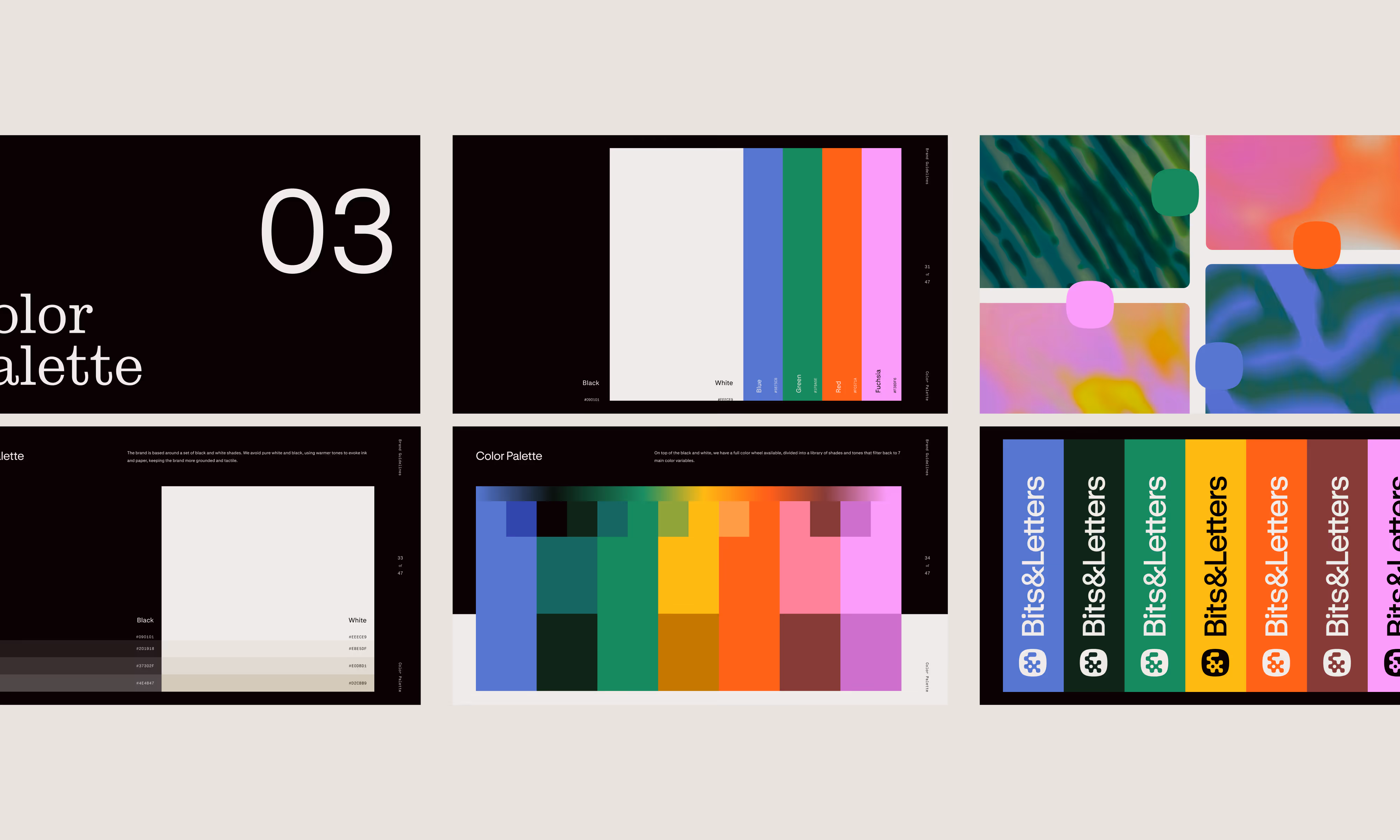
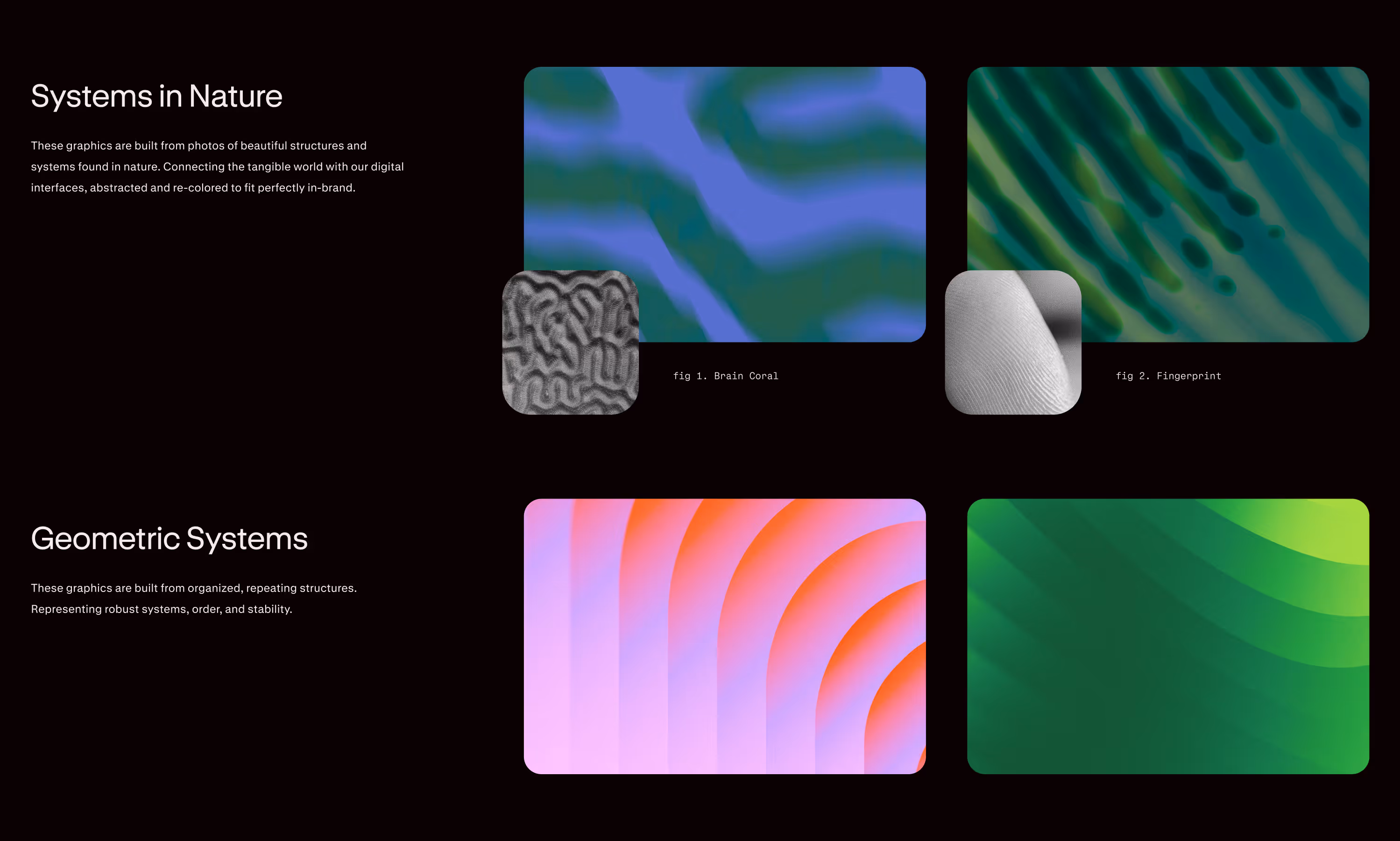
Color, pattern, and texture
Very early on in the process we started talking about the idea of systems in nature like fungi, algae, beehives, and fingerprints. It's the perfect distillation of our concept: organic, natural shapes creating incredibly intricate patterns and structures. At first we started collecting images of these structures as inspiration. But then we started editing them, applying texture and color mapping, cropping, zooming, and ended up with a library of abstract imagery that became a huge part of the visual language of the brand.
These textures directly informed our colors. At first we tried to simplify it, but eventually we gave into the madness and created an expansive palette of tones and shades that basically encompass the entire rainbow. It may seem like overkill at first, but used sparingly among heavy black and white, it is highly effective.
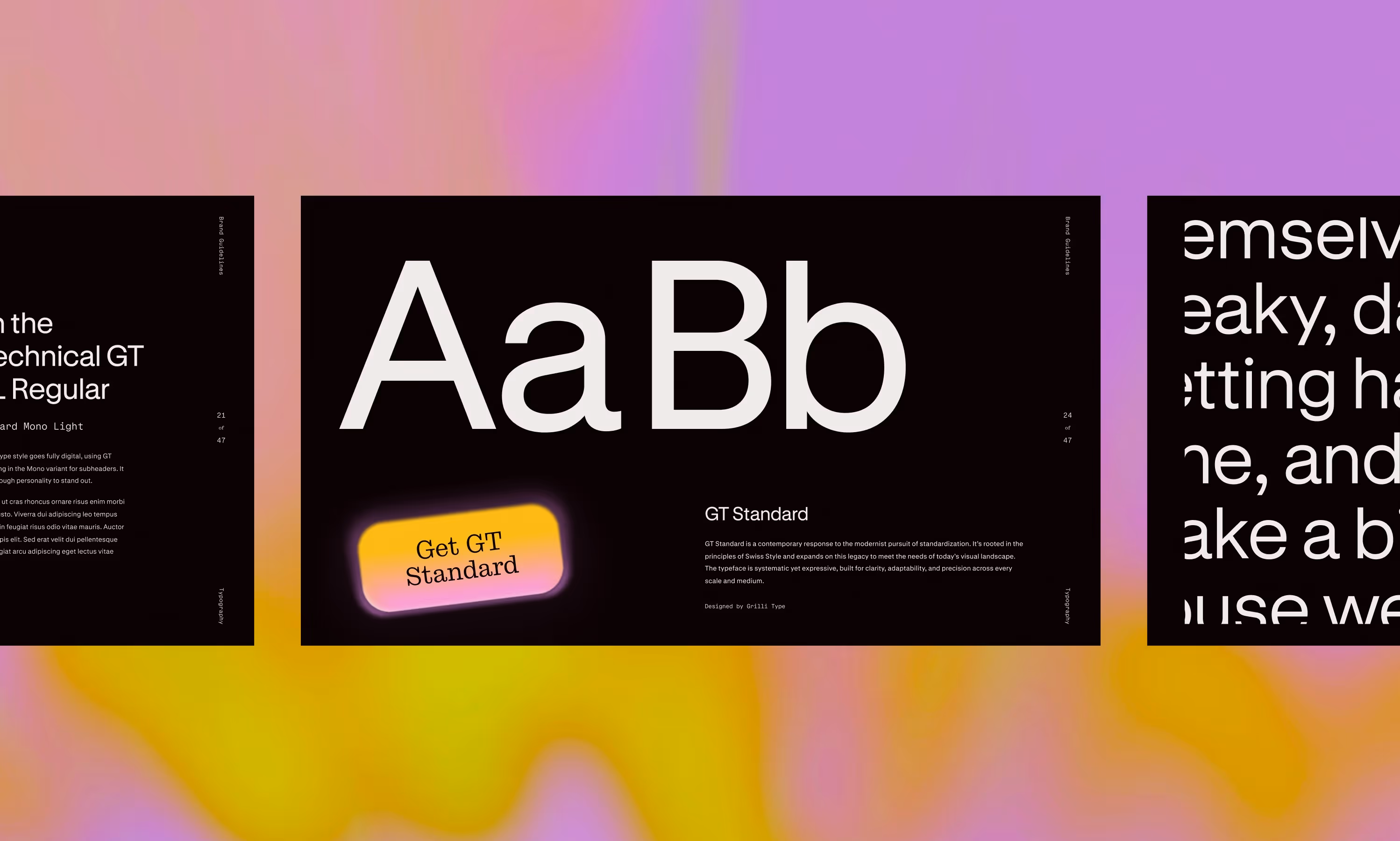
Typography
To complement our beautiful visuals, we turned to two of our absolute favorite typefaces. David sent us the announcement for GT Standard from Grilli Type and we knew instantly it would be a perfect foundation, a beautifully simple and effective sans-serif. To compliment, we brought in Stringer by Order, a slab-serif inspired by newspaper typefaces, the perfect digital-meets-physical style for Bits&Letters.
Color, pattern, and texture
Very early on in the process we started talking about the idea of systems in nature like fungi, algae, beehives, and fingerprints. It's the perfect distillation of our concept: organic, natural shapes creating incredibly intricate patterns and structures. At first we started collecting images of these structures as inspiration. But then we started editing them, applying texture and color mapping, cropping, zooming, and ended up with a library of abstract imagery that became a huge part of the visual language of the brand.
These textures directly informed our colors. At first we tried to simplify it, but eventually we gave into the madness and created an expansive palette of tones and shades that basically encompass the entire rainbow. It may seem like overkill at first, but used sparingly among heavy black and white, it is highly effective.
Typography
To complement our beautiful visuals, we turned to two of our absolute favorite typefaces. David sent us the announcement for GT Standard from Grilli Type and we knew instantly it would be a perfect foundation, a beautifully simple and effective sans-serif. To compliment, we brought in Stringer by Order, a slab-serif inspired by newspaper typefaces, the perfect digital-meets-physical style for Bits&Letters.


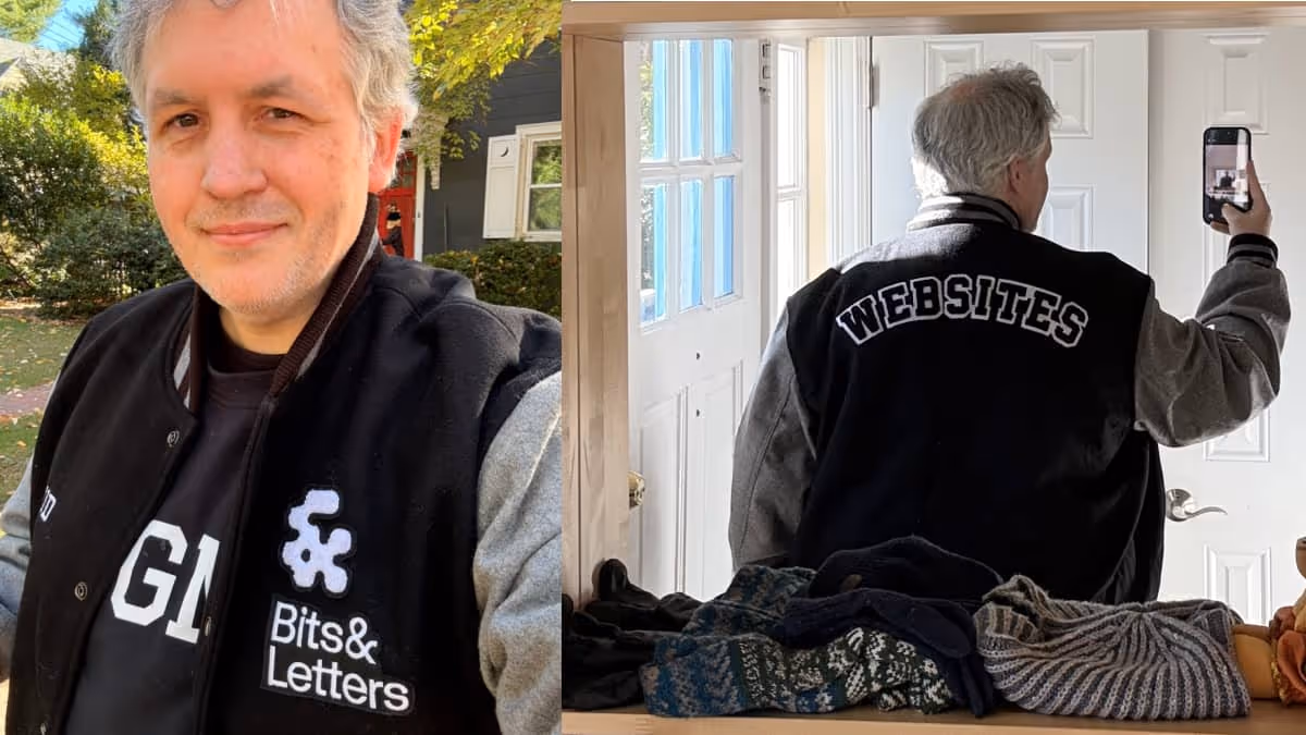
David brought such an infectious joy and energy to this project. Every proof was met with excitement and new ideas, and he was mocking up web layouts and ordering merch before we could even finish our brand guidelines.
David brought such an infectious joy and energy to this project. Every proof was met with excitement and new ideas, and he was mocking up web layouts and ordering merch before we could even finish our brand guidelines.
David brought such an infectious joy and energy to this project. Every proof was met with excitement and new ideas, and he was mocking up web layouts and ordering merch before we could even finish our brand guidelines.
David brought such an infectious joy and energy to this project. Every proof was met with excitement and new ideas, and he was mocking up web layouts and ordering merch before we could even finish our brand guidelines.