
Changing how production is done, for the better.
Hometeam is a global video production company with a groundbreaking model. Instead of sending crews across the country or across the world, they source and manage a worldwide network of filmmakers, giving brands and artists access to great local crews anywhere they want to shoot. They have accessed this network to film contestant packages for The Voice, ad and documentary content for Google across 5 continents, a single-day shoot across 36 cities in 28 countries for Starbucks, and many other incredible projects.
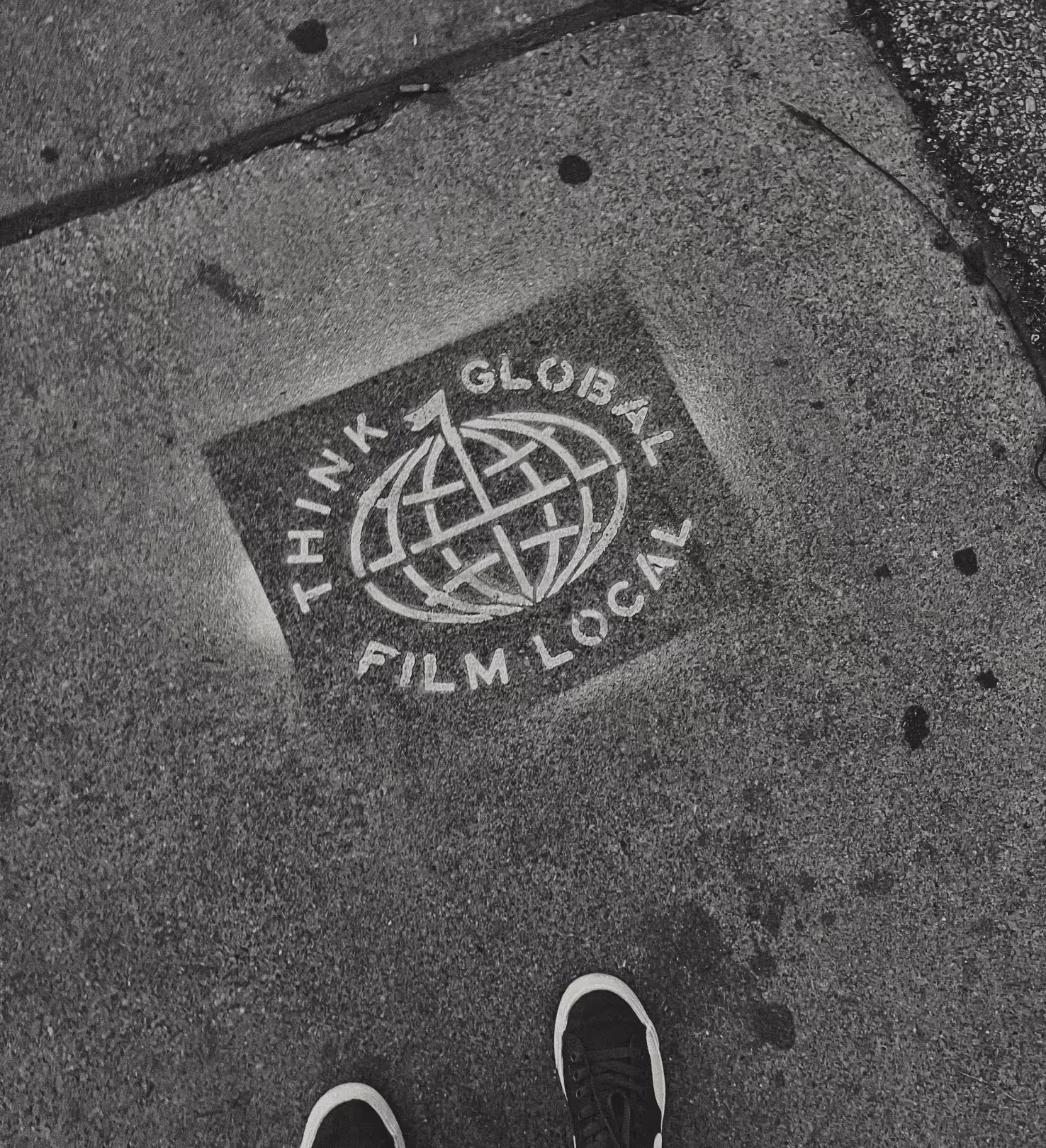
As we started the branding project, we talked to family and friends about doing work for this awesome brand called Hometeam. Everyone commented on how brilliant the name is. The promise of a "local home team" to every project, all over the world. We wanted the brand to communicate this promise clearly and confidently. So we looked to sports.
Not the spiky futuristic Nike-inspired sports branding, but the scarves, flags, and banners filling college football bleachers and European soccer stadiums. Where nothing but a color or a pattern can bring strangers together, unified in goals, history, and camaraderie.
Featured on Brand New!
Reviewed in BrandNew
BrandNew's "Best of 2023"
Original Script Logo by Butler
Script Logo Animation by Bad Lucky Studio


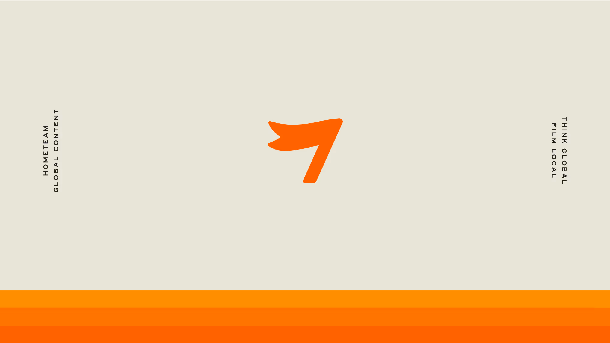
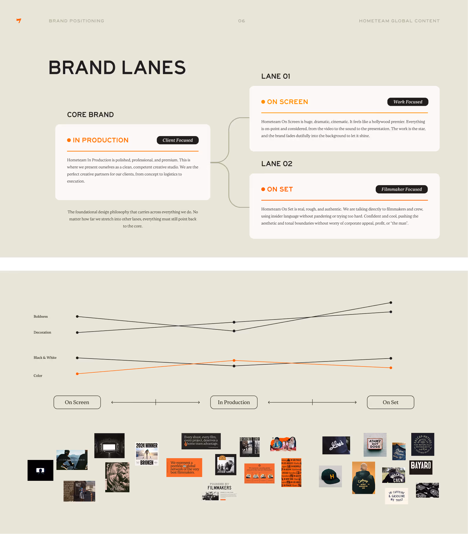
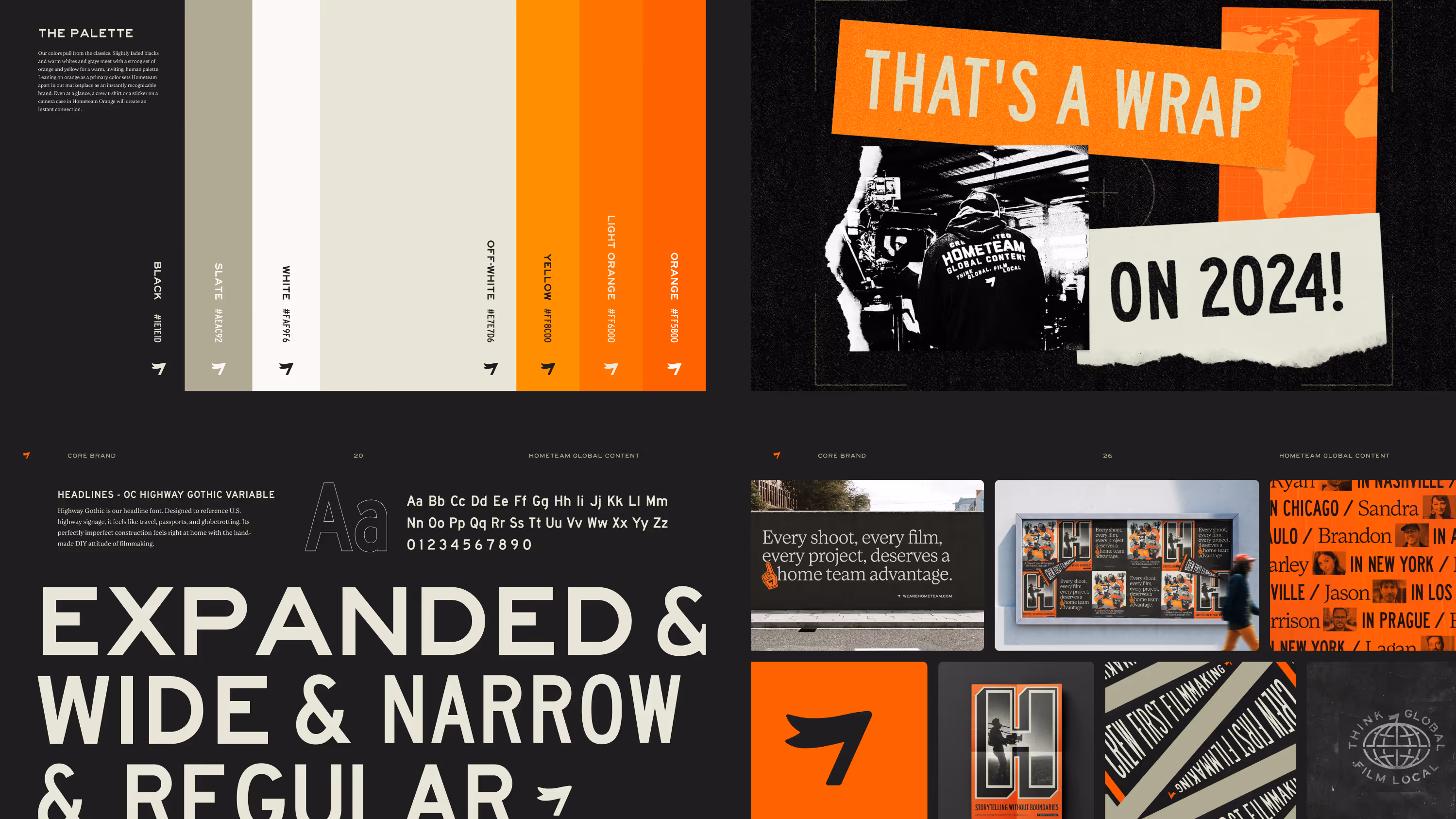
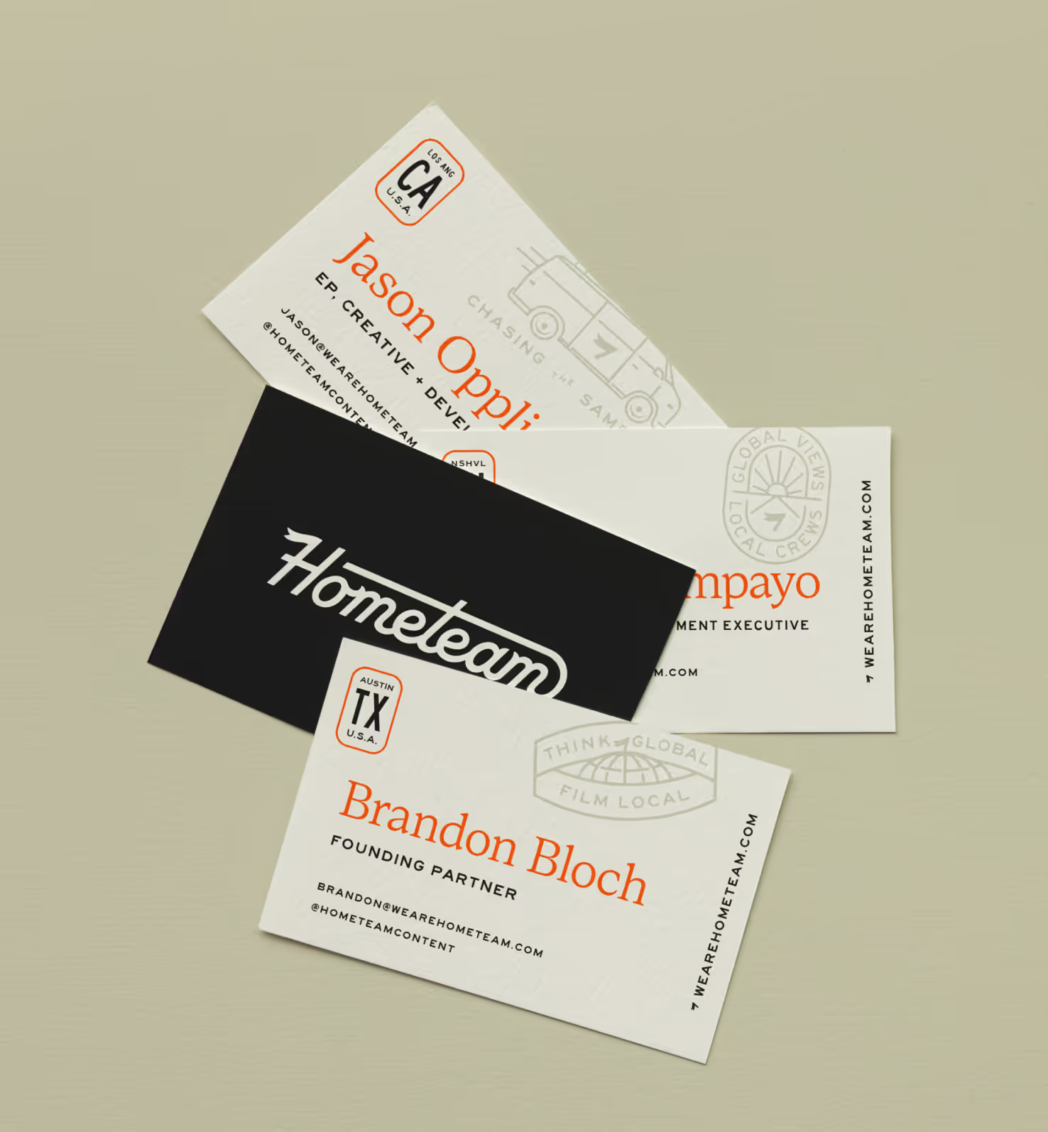
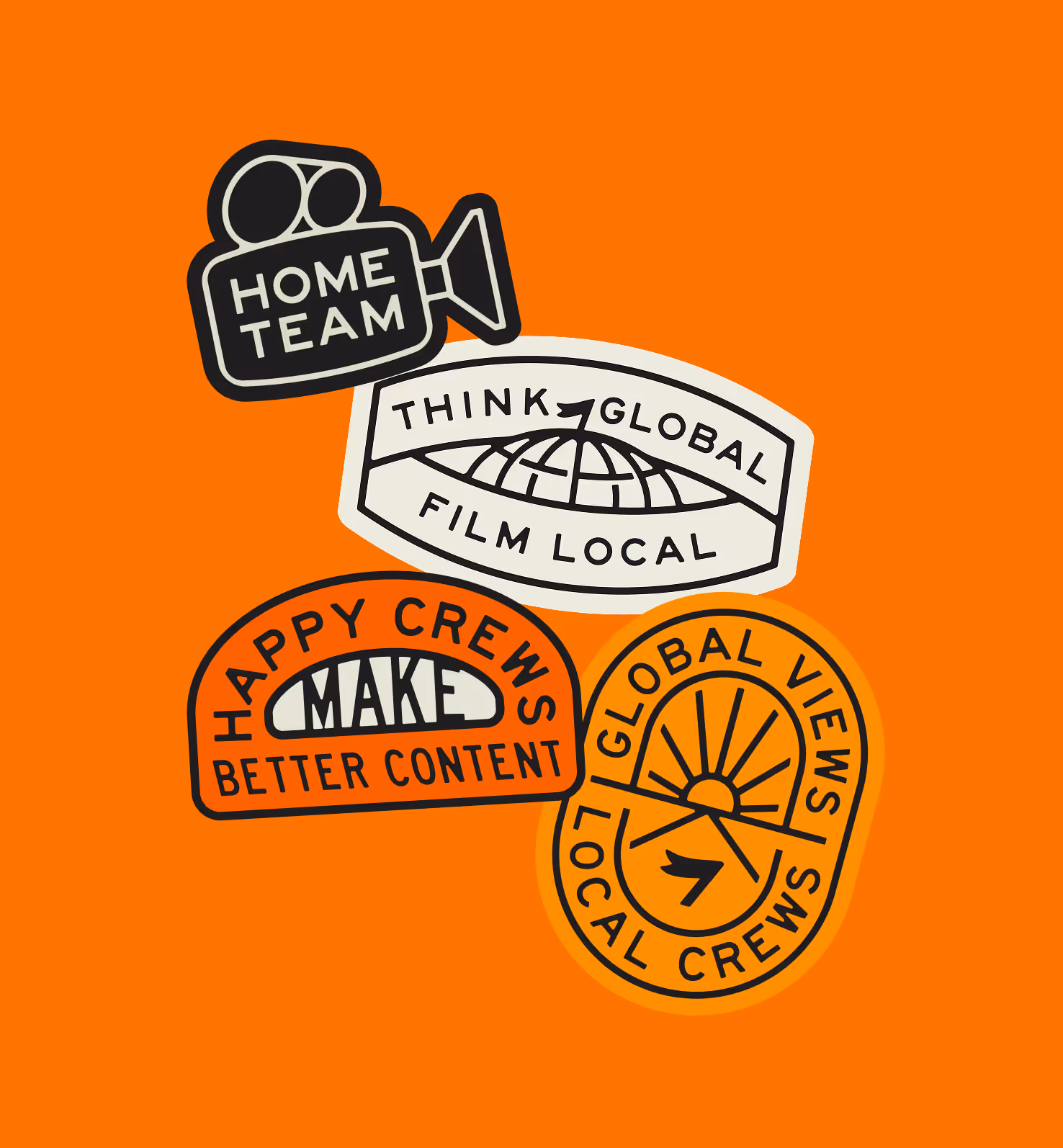
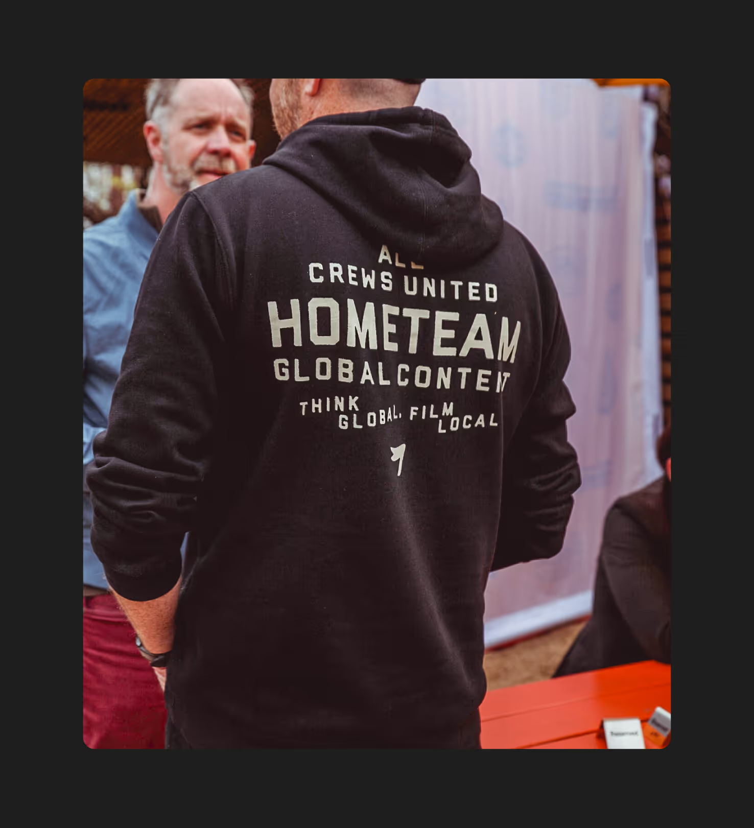
Starting with a great logo designed by Butler, we pulled out a simple pennant icon that gave us a flexible and quickly recognizable brand piece. From there, we developed a unique and bold color palette, with a not-quite-black, a not-quite-white, and a strong orange leading the charge. Warm, faded colors might not seem like an instant match for a modern digital video company, but our focus was on who Hometeam are, not on what they do.
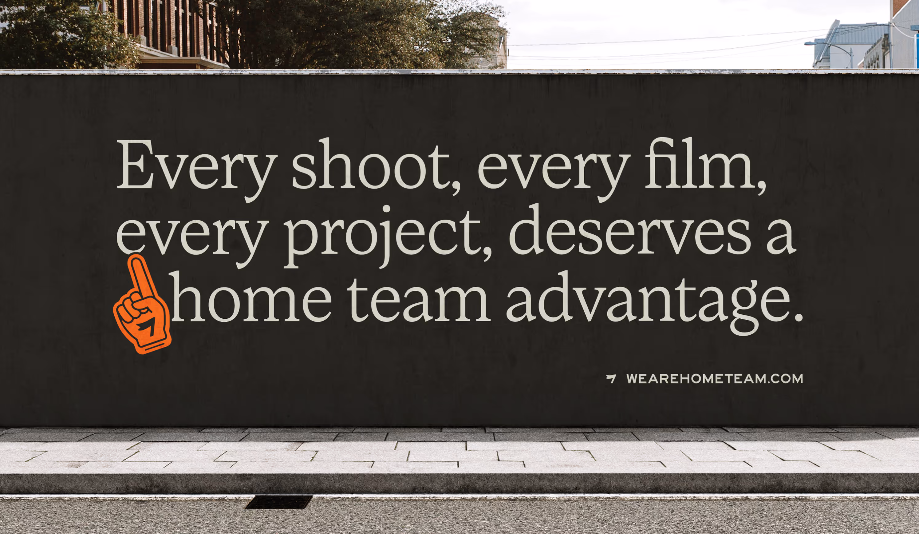
Once we had our logo, icon, and palette, we worked with the Hometeam team to develop a set of brand phrases and taglines; expressing the values and the unique capabilities of their global filmmaker network. We turned some of these into badges, which led the way into stickers, posters, and the website design.
Starting with a great logo designed by Butler, we pulled out a simple pennant icon that gave us a flexible and quickly recognizable brand piece. From there, we developed a unique and bold color palette, with a not-quite-black, a not-quite-white, and a strong orange leading the charge. Warm, faded colors might not seem like an instant match for a modern digital video company, but our focus was on who Hometeam are, not on what they do.
Once we had our logo, icon, and palette, we worked with the Hometeam team to develop a set of brand phrases and taglines; expressing the values and the unique capabilities of their global filmmaker network. We turned some of these into badges, which led the way into stickers, posters, and the website design.

Chasing the Same Sun
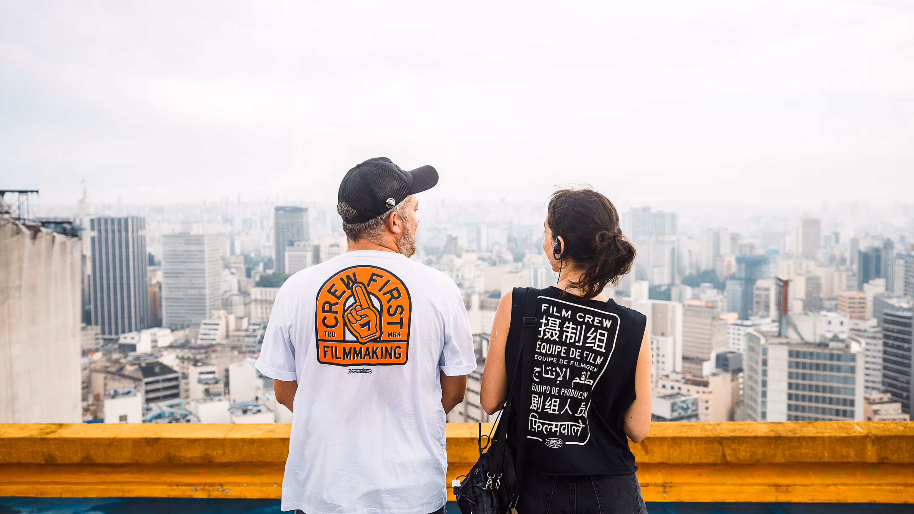
When it all comes together. In January 2025, Hometeam released an original short film called Chasing the Same Sun. This was a single day of production, captured around the world by Hometeam crews in USA, Brazil, Australia, South Africa, India, and Spain. It is the culmination of Hometeam as a concept: a united, global team producing one piece of content simultaneously. We also felt that it was a fully realized moment for the brand. We didn't actually produce anything new for it, but the team was able to take our imagery, type, and color and make something perfectly Hometeam. The brand matches the company, which matches the people, and so it all flows so naturally and beautifully.
Chasing the Same Sun
When it all comes together. In January 2025, Hometeam released an original short film called Chasing the Same Sun. This was a single day of production, captured around the world by Hometeam crews in USA, Brazil, Australia, South Africa, India, and Spain. It is the culmination of Hometeam as a concept: a united, global team producing one piece of content simultaneously. We also felt that it was a fully realized moment for the brand. We didn't actually produce anything new for it, but the team was able to take our imagery, type, and color and make something perfectly Hometeam. The brand matches the company, which matches the people, and so it all flows so naturally and beautifully.
Bringing Hometeam online
We've gone through a couple different iterations of the Hometeam website, working off of existing platforms fit into the new brand. But in 2024 we were able to build something from the ground up. A living, evolving site that puts the incredible work forward, using all the pieces and different moods of our brand exactly where they are needed.