
How to mockup (almost) anything in Photoshop
Hello!
I’m Jesse, Co-Creative Director and Co-Founder of Trust Design Shop. When we’re presenting our work to clients or potential clients, we rely heavily on mockups. For a small studio like us, producing and photographing real life products isn’t an option, but showing our work in flat vectors doesn’t have nearly the impact of a realistic mockup.
Sometimes we use mockup templates that we find online, but there often isn’t anything that quite matches what we need, so we make our own! Let’s walk through how we do it:
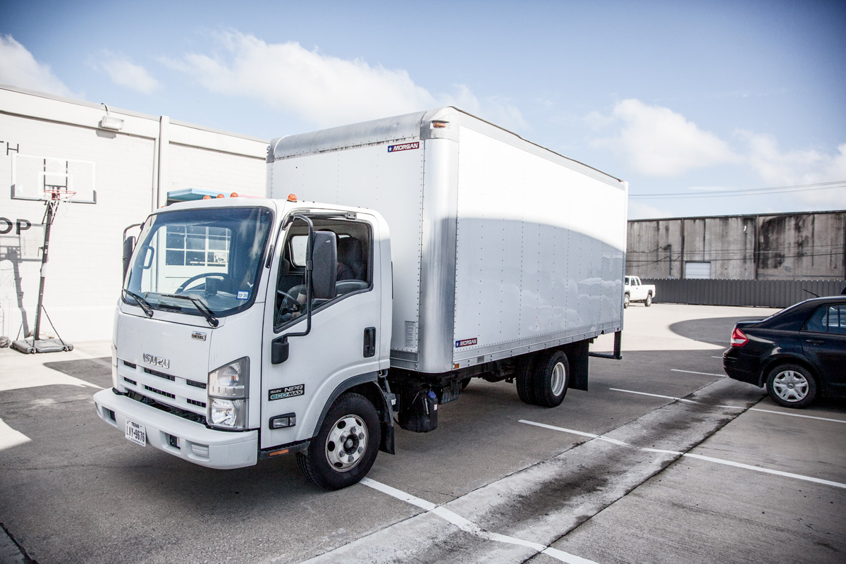
Step 1: Pick an image
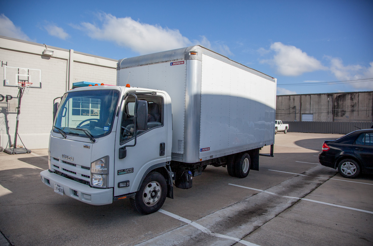
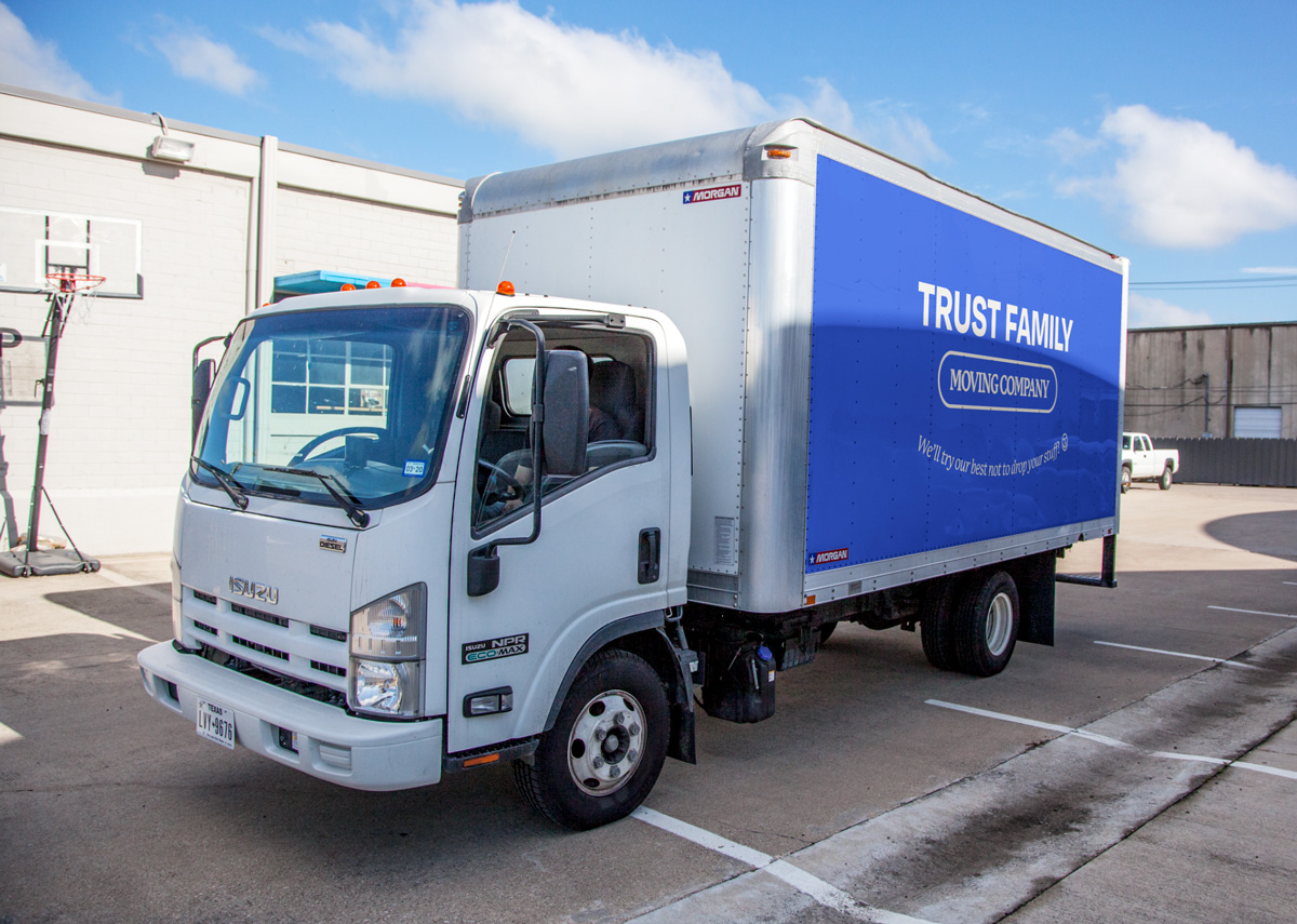
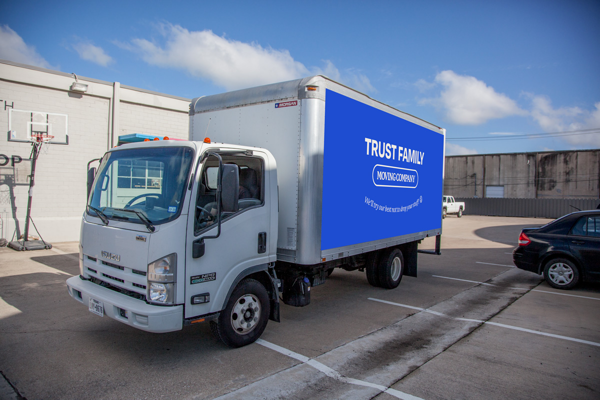
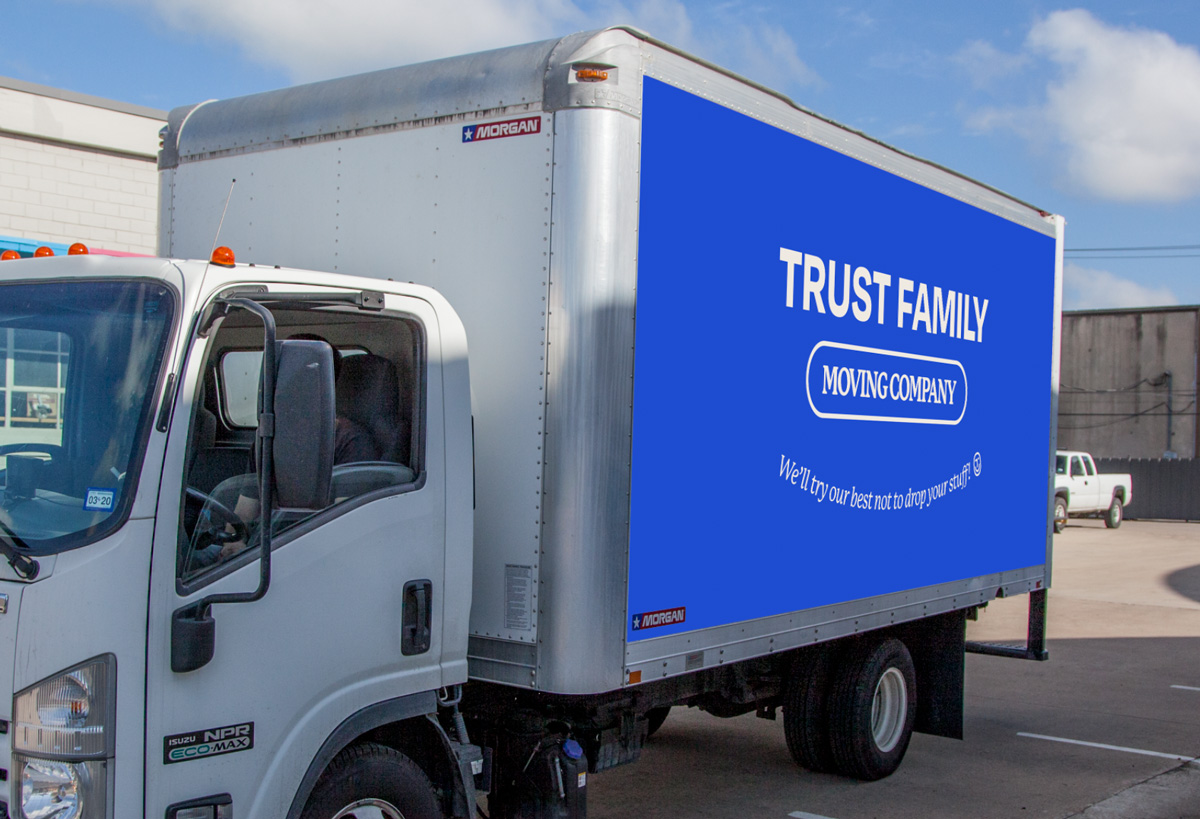
For our example we’ll be mocking up a wrap for a box truck. In this case I have a photo of the actual box truck to use, but if I was shopping for one, I’d look for something with a white, unobstructed surface. A surface with designs or color on it will need a few extra steps of editing before starting the mockup process. I won’t get into that in this article, but the goal is again to get back to a white surface.
Step 2: Create your canvas
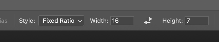
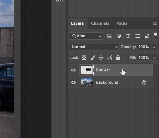
Opening our image in Photoshop, our next step is to define the canvas for our design. I prefer to create a Smart Object for each section of the truck, so I’d do one for the side of the box, one for the front of it, and one for the side of the cab. You could put the entire side of the truck in one Smart Object, you’ll just have to spend more time masking off all of the extra in-between spaces. Start by making a rectangle, the goal here is to match the aspect ratio of the actual object. Sometimes you’ll be able to find it exactly, and sometimes you’ll have to take your best guess. In our case, I know the box is 16 x 7 feet, so I will grab the Marquee tool, select “Fixed Ratio”, put in 16x7, and then create a selection on a new layer and fill it.
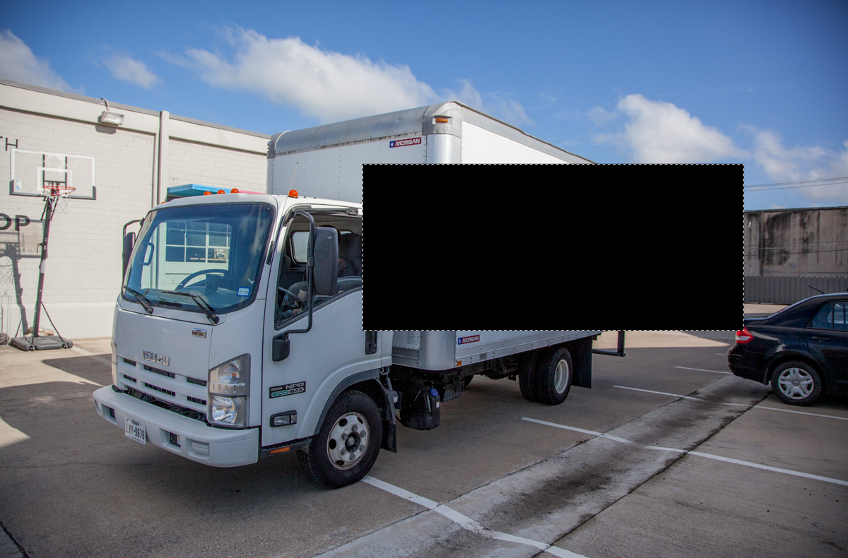
Make sure the opacity of the rectangle is at 100%, and then right click on it in your layers palette and convert to a Smart Object.
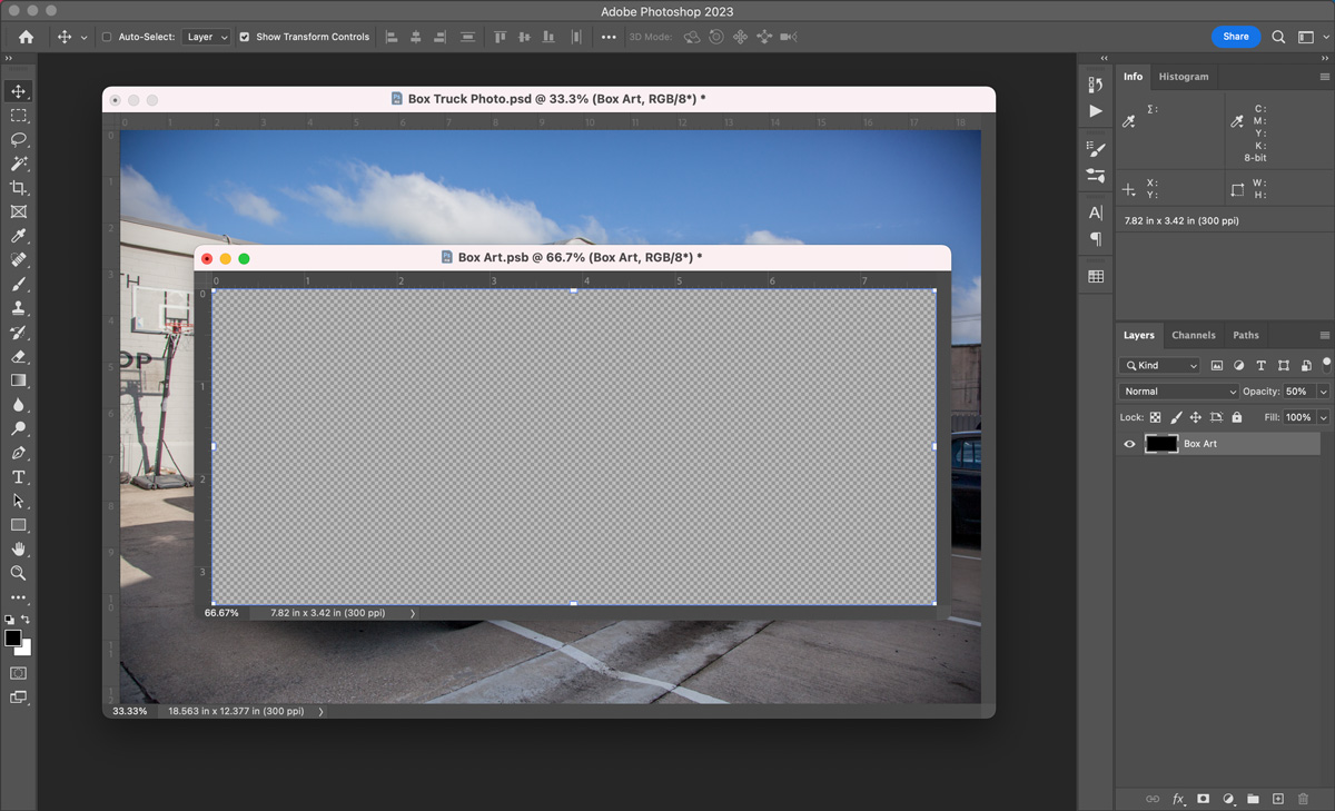
Step 3: Define a Smart Object
If you aren’t familiar with Smart Objects, they link external documents to an Art Layer. This allows us to distort or edit the layer without being destructive on the underlying objects. Once we’ve created a Smart Object we can double click it to open the linked document. As we edit this document, you can see the original file isn’t changing. The changes will only be applied to the original file when we save. To set up for our next step, I like to put a solid background in the new Smart Object document, and then drop it to 50% opacity. Don’t forget to save and then close for now.
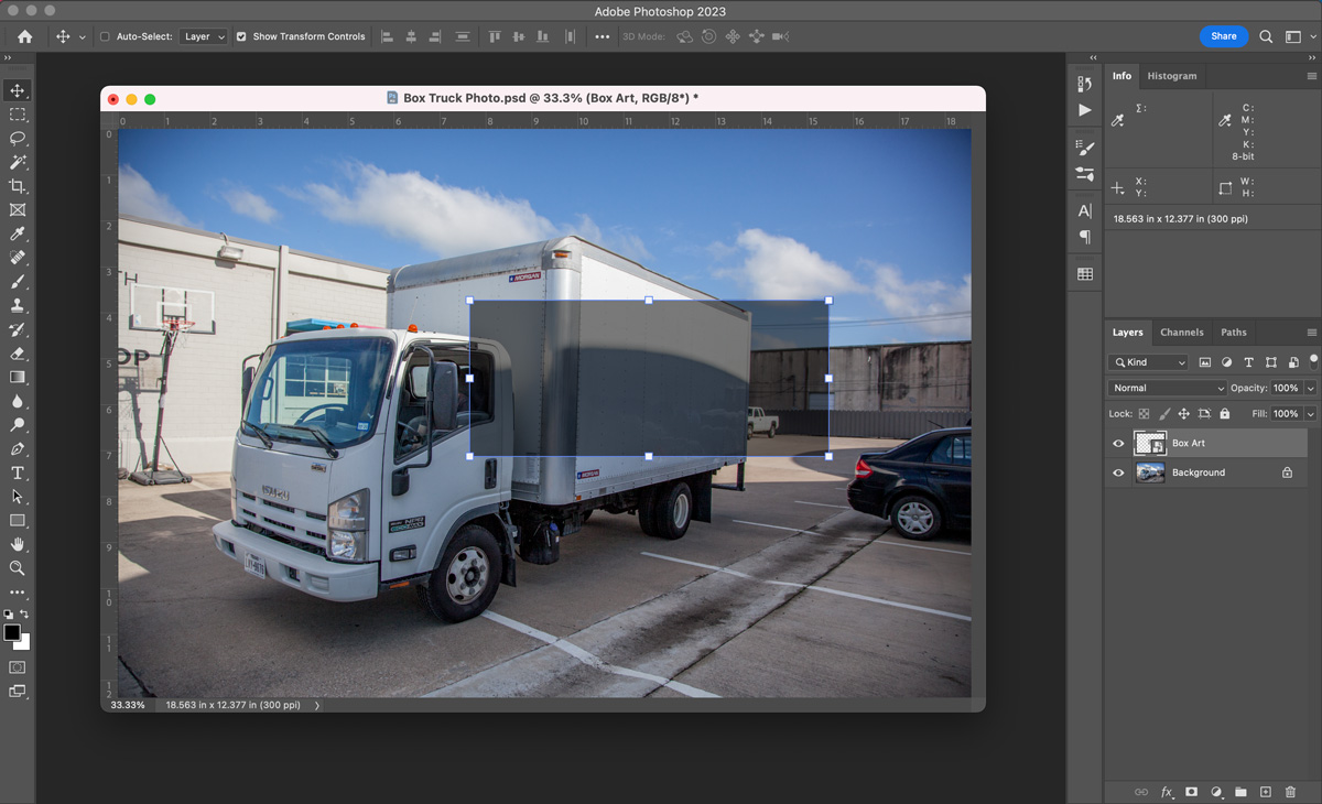
Step 4: Shape to your surface
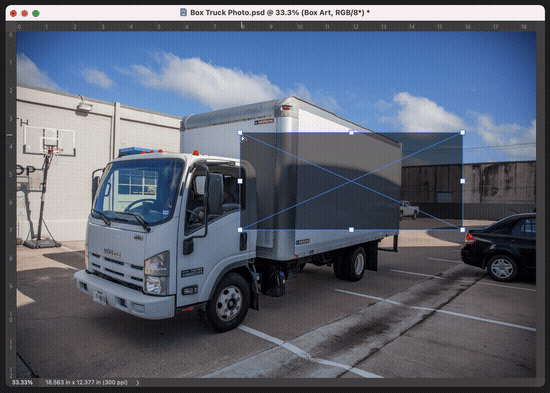
Now it’s time for the magic. We will distort our layer to match our surface. If it’s a flat surface like we have in this example, the Distort tool is probably your best option. Drag your corners to match the area you want your design to cover. This will be the “printable area”. When in doubt, overshoot, you want to make sure you have everything covered so that you’ll be able to add background colors without leaving any gaps. We can always remove the overshooting areas later.
Open the Smart Object again with a double click, and we can drop our design in to see how we’re looking. If your graphic is in Illustrator, you can copy and paste it straight into the Smart Object file. If it's an image, just drag it in. Put your art on top of the background layer, but don't delete it, we’ll still need that in a bit.
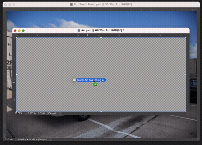
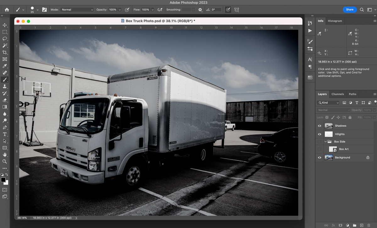
Looks pretty good! Our Smart Object layer is easily editable, and our art is matching the size and perspective that we need it to, but nobody is going to believe that this is a real printed box truck; we’ve got a couple more steps. Turn your art off and your background back on with 50% opacity so we can see our edges, and then save and close the smart object document again.
Step 5. Mask off obstructions
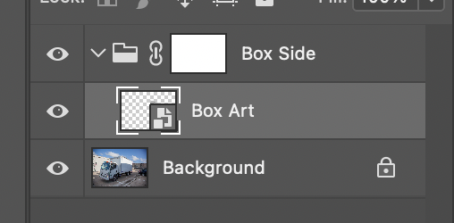
We need to mask off any obstructions in the surface. Things like door handles that will be cut out when this truck gets wrapped for real. Instead of putting the mask on the smart layer itself, let’s make a new folder. I'm calling it "Box Side” to differentiate if we later mockup different parts of the truck. Drag your Smart Object layer into it, and then put a mask on the folder. Again, this is less destructive. The layers inside the folder can be moved, distorted, or added to, and they will all be masked off to match our surface.
So we have our mask, let’s start adding to it. You can use tools like Quick Selection or Magic Wand for this, but I prefer the classic Brush Tool. Hit “d” and then “x” on your keyboard to make sure we’re snapped to pure black, and start painting in anything that you want to be cut out of the finished product. Depending on your image, you’ll need a different hardness level for your brush, it will take some trial and error, but you want the edges of your brush to match the resolution and sharpness of the image.
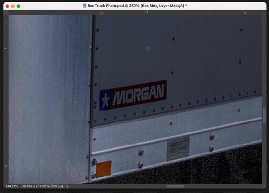
The level of detail you put in here will be a massive factor in how real your final product looks. You may not need photorealism if it’s a quick proof of concept, or you might need ultimate photorealism if this is a mockup for a public presentation. Depending on the fidelity you’re looking for and the complexity of your shape, this could take 2 minutes or 2 hours. The beauty of using masks and layers the way we are is that you can can always come back and make tweaks.
Step 6: Add lighting effects
This is the final step, and also the longest, let's make this thing look realistic!
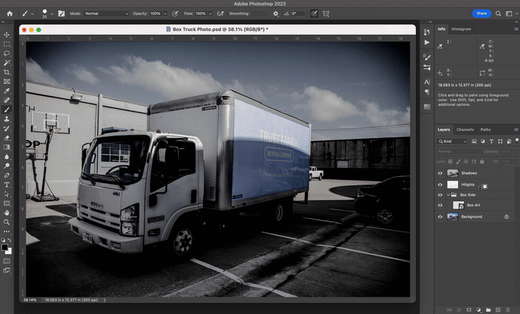
If we unhide our art layers in the Smart Object document, we can see that our art is the right perspective, at the right size, masked off to only appear where the real truck wrap will appear. But it still doesn't look real. That’s because it’s flat! Things in real life are not flat, we need the shadows and highlights.
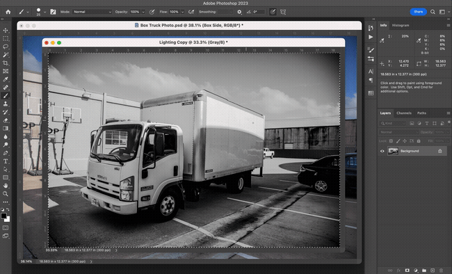
Again, we don’t want to be destructive on our real file, so we will make a quick copy of the document. Delete all of the art layers and smart objects on the copy until you’re left with the flat background. (If you edited the original to before step 1, don’t delete any layers involved with that process)
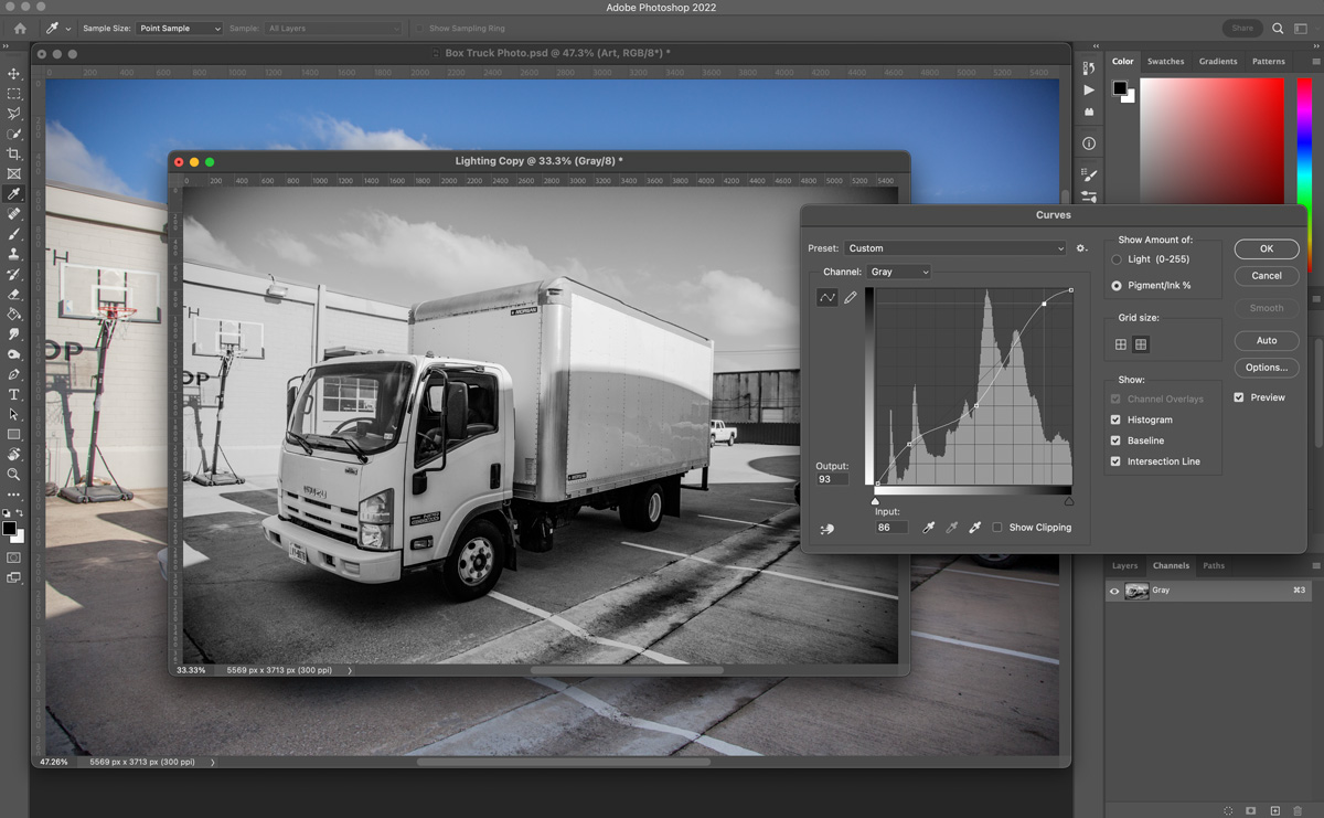
Go to Image > Mode and change to Grayscale. Go ahead and hit yes to merging layers, and then flip over to the Channels panel where you should see a single Grey channel. At this point, I usually like to edit the curves a little bit, boosting the shadows and highlights and cutting a bit of the mid-tones. This seems to just make the final product a little less muddy. This is the curve I’ve applied, but this will be very image specific, so experiment yourself.
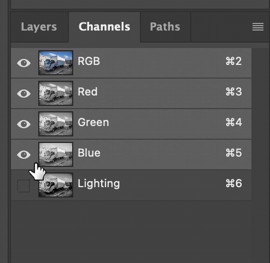
Commit your changes, and now we’re ready to pull these to our mockup file. Select All (cmd or ctrl + a) and copy (cmd or ctrl + c), then switch over to your mockup file (I like to keep my copy document open just in case I need to change something later). Go to the channels panel create a new channel, and then paste (i bet you know how to paste, but for consistency I'll go ahead and specify that it's cmd or ctrl + v).
Now we’ll make separate shadow and highlight layers. First, depending on your system, Cmd+click or Ctrl+click on the thumbnail next to the Alpha 1 channel, then flip over to the layers panel and create a new layer. Call it “Highlights” (or "Hilights" if you're me and misspelling it when you're making the gif below), drag it to the top of the layers list, and then fill the selection with white. This will look like overkill at first, but don’t worry we’ll fix it in a minute.
Repeat those steps again, but this time call the layer “Shadows”, and before you fill it, hit Select > Inverse from your menu, and then fill with black.
You’ll notice that the lighting is applying everywhere. We only want it on our image, so select the highlight and shadow layers, right click, and hit Create Clipping Mask. The lighting is now just applying to our art, but it’s too heavy. So simply reduce the opacity on the lighting effects. The highlights will usually be a lot lower than the shadows, and this again depends on your image and the curves you applied earlier in this step. I went with the highlights at 20% and the shadows at 75%.
Conclusion
And that’s it! We have a realistic and fully editable mockup. To finish this out, repeat the steps for any pieces of the truck that will be wrapped. For more complicated shapes like the cab of the truck, just fully cover them with your smart object and then mask off anything that’s overhanging.
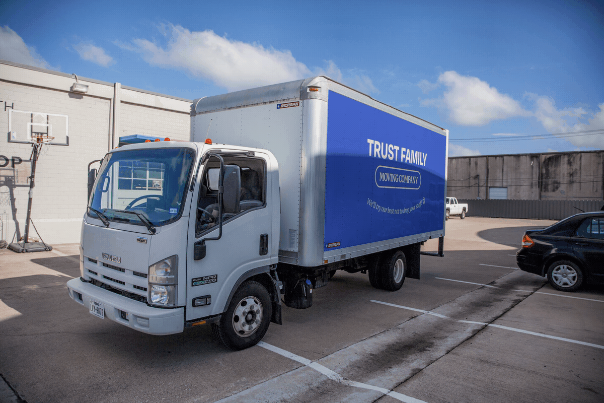
This process can be used to create mockups of pretty much anything, and it can be pushed even further with 3D warping, textures, and more complicated masking.
Thanks for reading!
